
Best Practices for Real-Time Stakeholder Dashboards
Real-time dashboards are transforming how commercial real estate professionals manage data and make decisions. They offer instant access to live metrics, replacing outdated spreadsheets and manual reports. By consolidating data into a single view, these dashboards improve transparency, streamline decision-making, and help stakeholders track key financial, operational, and sustainability metrics.
Here’s what matters most when building effective dashboards:
Understand Stakeholder Needs: Tailor metrics to specific roles - property managers, investors, and executives all have different priorities.
Choose the Right Metrics: Use measurable, goal-oriented data points like net operating income (NOI) or occupancy rates.
Automate Data Updates: Link systems via APIs and automate updates to ensure accuracy and timeliness.
Design for Usability: Create clear layouts, prioritize essential insights, and customize views for different users.
Enable Interactivity: Add filters, drill-downs, and responsive designs for better data exploration.
Ensure Security and Compliance: Protect data with encryption, access controls, and regular audits to meet legal requirements.
Platforms like CoreCast simplify these processes by integrating data sources, automating updates, and offering customizable dashboards starting at $50 per user per month. By focusing on clarity, automation, and security, you can create dashboards that empower stakeholders to make informed decisions quickly.
Real Estate Analytics: A Complete Power BI Dashboard
Understanding Stakeholder Needs and Goals
Before creating any dashboard, it's crucial to understand who will use it and what they aim to achieve. This step is the difference between building a tool that drives decisions and one that gets ignored. Identifying stakeholder needs is the foundation for delivering actionable insights in real time.
In commercial real estate, stakeholders have varying priorities and data requirements. For instance, property managers focus on metrics like maintenance costs and tenant satisfaction. Investors, on the other hand, care about portfolio performance and ROI. Executives look for high-level strategic insights, while analysts dive into detailed, filterable data.
"We have found that the best way to identify dashboard requirements is to start with the end goal. What are we trying to accomplish with this dashboard?" - Will Yang, Instrumentl
To design an effective dashboard, start by mapping your stakeholders based on their influence and interests. Asset managers, for example, might need portfolio-level insights, while property managers prioritize operational data. Meanwhile, external investors require transparent performance reporting.
Engaging stakeholders directly is key. Hold discussions to understand their daily challenges, workflows, and the decisions they need to make. This ensures your dashboard evolves into a decision-driving tool rather than a static report.
Once stakeholder roles and needs are clear, the next step is selecting metrics that align with their goals.
Choosing the Right Metrics for Stakeholders
Metrics should follow the SMART framework: specific, measurable, achievable, relevant, and time-bound. This ensures alignment with both individual KPIs and broader organizational objectives.
For property managers, useful metrics include occupancy rates, average lease terms, maintenance costs per square foot, and tenant retention rates.
Investors often focus on financial performance, tracking net operating income (NOI), cash-on-cash returns, internal rate of return (IRR), and debt service coverage ratios. These metrics are often paired with market comparisons and diversification insights.
Asset managers require a mix of operational and financial data. They might monitor revenue per square foot, operating expense ratios, capital expenditure trends, and market vacancy rates across their portfolio.
"Every dashboard needs to tell a story visually, so we work with stakeholders to determine a common end goal and work backward from there, making metric suggestions that can all help keep the 'story' on track." - Fernando Lopez, Circuit
Your dashboard should visually narrate business objectives. For instance, if the goal is reducing tenant turnover, focus on metrics like lease renewal rates, tenant satisfaction scores, and time-to-fill vacant units. If the priority is improving portfolio performance, highlight comparative metrics and market benchmarks.
It’s also important to consider your audience’s data literacy. Executives often prefer high-level KPIs with trend indicators, while analysts need detailed, filterable data. Tailoring the presentation of data ensures it serves different needs effectively.
Meeting Internal and External Stakeholder Requirements
Designing dashboards for both internal teams and external partners requires a balance of transparency and relevance. Tailored metrics should serve diverse groups, and role-based permissions are essential to maintain data integrity.
For internal teams, dashboards should integrate seamlessly with their workflows. For instance, property management teams might benefit from dashboards embedded in maintenance systems, while finance teams may need dashboards that sync with accounting software. This minimizes friction and ensures easy access to critical data.
External stakeholders, such as investors and lenders, need consistent, clear reporting. Dashboards for these users often include comparative data, market context, and simple explanations of performance drivers.
Role-based permissions are vital to ensure each group accesses only the data they need. Internal teams might require full operational data access, while external partners see only relevant performance metrics. This approach safeguards sensitive information while keeping everyone informed.
Regular feedback loops are essential to keep dashboards relevant. Quarterly reviews can help evaluate whether the metrics and visualizations are meeting stakeholders’ needs. By staying engaged with all user groups, your dashboards can adapt to shifting business priorities and remain a valuable decision-making tool.
Connecting and Automating Real-Time Data Sources
To build effective dashboards, you need data that's always accurate, up-to-date, and seamlessly integrated. Real-time dashboards can lead to a 37% increase in user participation, thanks to providing stakeholders with reliable, current information that supports better decision-making. Let’s dive into how you can connect multiple data streams and automate updates for maximum efficiency.
Linking Multiple Data Sources
Bringing together data from various sources - like property management systems, financial tools, market data feeds, and operational platforms - into a single dashboard is key to better insights. A well-integrated dashboard ensures a smooth flow of information, making decision-making more efficient. The cornerstone of this process is interoperability. Focus on systems with well-documented APIs that use open formats such as JSON, XML, or CSV to enable seamless data sharing.
To manage multiple data streams effectively, set up a master dataflow with built-in validation and caching. This serves as the backbone for your dashboard, supporting multiple stakeholder-specific views while maintaining a consistent data foundation.
"Success depends on how you design, manage, and evolve your integrations over time. Prioritizing interoperability and automation, while standardizing on open APIs and data formats, helps set integration efforts up for long-term impact." - Superblocks Integration Strategy Team
To ensure consistency across systems, create a data dictionary with standardized definitions. For more complex integrations where systems might not naturally align, use middleware solutions to bridge gaps. ETL tools (Extract, Transform, Load) can also simplify and streamline the integration process.
Setting Up Automatic Updates for Accuracy
Automation turns static dashboards into dynamic tools that adapt to real-time needs. By 2024–2025, over 65% of organizations had adopted automation workflows for routine dashboard tasks, a jump from 48% in 2022. Scheduled updates ensure dashboards remain relevant, avoiding decisions based on outdated data. The frequency of updates should match the pace of your data sources - daily for financial data, perhaps weekly for market comparisons.
Set up error alerts to catch anomalies or failed data pulls before they impact users, maintaining trust in your dashboard's reliability. Use version control tools like Git to track changes and roll back to previous versions if new updates cause issues. Before rolling out updates, regression testing ensures existing features remain functional. Ongoing monitoring and user feedback help refine automation processes to meet changing needs.
Streamlining these processes with a consolidated solution can make automation even more efficient.
Using CoreCast for Data Consolidation
CoreCast simplifies the challenge of integrating multiple data streams by centralizing workflows and providing a single source of truth. This platform automatically ingests and normalizes data from various sources, eliminating the manual effort often required for consolidation. It offers a live, unified dashboard that supports decision-making across areas like acquisitions, asset management, and portfolio strategy. By centralizing data, CoreCast removes the need to toggle between systems or reconcile conflicting information.
CoreCast also automates tasks like underwriting, pipeline tracking, and asset reporting, reducing errors caused by manual data entry . The platform’s flexibility allows customization for different stakeholders, ensuring everyone sees the metrics they care about while maintaining consistency across the board. This approach not only saves time but also enhances the reliability of your data-driven decisions.
Creating Simple and User-Friendly Dashboards
Once you've set up automated, real-time data, the next step is making that data accessible through dashboards that are easy to use and understand. A well-crafted dashboard isn’t just about numbers - it’s about presenting the most critical insights in a way that’s clear and logical for the user. Different stakeholders have different needs, so your dashboard should highlight key information without overwhelming anyone.
Building Clear and Logical Layouts
Designing an intuitive dashboard starts with understanding how people naturally process information. Most users follow predictable reading patterns, like the F and Z shapes, starting at the top left corner and scanning across and down. This means your most important data should go right where it’s most likely to grab attention.
Start by identifying the top five takeaways your dashboard needs to deliver. For example, in real estate, these might include portfolio performance, deal pipeline updates, or essential financial metrics that guide decisions. Place the most critical data in prominent positions.
Use a grid layout to group related information logically. Visual hierarchy is key - use font sizes, colors, and spacing to emphasize important data. Group similar metrics together and leave enough white space to avoid a cluttered look [13]. Begin with a high-level summary at the top to provide a quick overview that makes essential insights immediately visible [13]. Clear labels, consistent layouts, and logical groupings all contribute to a seamless user experience.
From there, you can refine the dashboard to cater to the specific needs of different roles.
Creating Custom Views for Different Roles
Once you’ve established a clear layout, the next step is tailoring dashboards to suit the unique priorities of various stakeholders. Not everyone needs the same level of detail, so custom views should align with the roles and responsibilities of each user - whether they’re executives, department heads, frontline staff, or external partners.
For example, executive dashboards should focus on high-level KPIs like revenue, profit margins, or customer acquisition costs. These dashboards often use visual tools like gauges or heat maps to highlight areas that need attention, while still allowing users to drill down for more detailed data if needed.
Sales teams, on the other hand, might benefit from dashboards that display metrics like individual and team performance, leads generated, and conversion rates. Adding interactive elements, such as filters for property type, region, or time period, helps them focus on the most relevant data. Features like goal tracking can also make it easier to monitor progress.
"Personalized dashboards should focus on the most critical metrics that drive decisions. Too many numbers clutter the screen and increase cognitive load, defeating the purpose of personalization." – Think Design
To create these custom views effectively, start by conducting stakeholder interviews and user research to understand their goals and challenges. Work with users to identify the KPIs that matter most to them, and include interactive features like filters and date-range selectors for a more personalized experience. Allow users to save multiple custom views for quick access.
Interactive tools like drill-downs, filters, and selectors give users the flexibility to explore data at their own pace. Real-time updates ensure that stakeholders always have the latest information at their fingertips. Regular testing and iteration will help refine the design, making it clearer and more engaging over time.
CoreCast’s stakeholder center is a great example of this approach in action. The platform allows users to customize layouts, adjust complexity, and select the data types most relevant to their roles. This ensures that stakeholders get the insights they need while maintaining consistency across the organization. By connecting comprehensive data with actionable insights, CoreCast demonstrates how effective dashboard design can make a real difference.
Transform Real Estate Data into Confident Decisions
Join Corecast to streamline your real estate operations, gain real-time insights, and make smarter investment decisions with a unified platform.
Improving Decision-Making with Interactive Features
Interactive features take dashboards to the next level, allowing stakeholders to dive into data and uncover insights like never before. Research highlights that interactive dashboards can lead to a 40% reduction in decision-making time, with users spending 30% more time exploring interactive dashboards compared to static reports.
The secret to effective interactivity? Giving users the power to control how they view and analyze data. As Shneiderman famously said:
"Overview first, zoom and filter, then details-on-demand" – Shneiderman
This method encourages users to start with a broad overview, zoom into specifics, and access detailed information when necessary. It creates an experience that's not only engaging but also highly productive, building on earlier automation and design strategies to give users a seamless way to navigate between high-level insights and granular details.
Adding Interactive Charts and Visualizations
Interactive charts and visualizations are game-changers, turning raw data into insights that users can explore dynamically. These tools make it easier to identify trends, track key performance indicators, and conduct deep analyses.
Consider how these visual elements simplify complex datasets. A line graph can highlight trends over time, a bar chart can compare data across categories, and a scatter plot can uncover relationships between variables. For real estate professionals, heat maps and dynamic charts can pinpoint trends across regions, property types, and timeframes. For instance, a sales team monitoring a real-time dashboard can instantly spot gaps in their monthly targets and take corrective action by visualizing sales data as it happens.
To make these visualizations even more impactful, add annotations like callouts, trend markers, and key data labels to emphasize important insights. Keeping charts proportional and providing clear descriptions of metrics ensures that data is easy to interpret and avoids confusion.
Research shows that businesses leveraging data visualization see faster decision-making and stronger collaboration among teams. Beyond visualizations, adding drill-down capabilities allows users to seamlessly access detailed information.
Adding Drill-Down Features
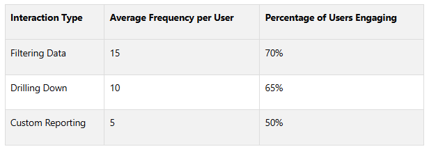
Drill-down features are essential for diving into data without getting lost in the details. They let users move from a high-level summary to specific metrics while maintaining context. This is especially useful in real estate, where executives may need to view portfolio performance at a glance but also want the option to examine individual properties, tenant details, or financial data.
Drill-down features are the second most popular interactive element, with 65% of users engaging with them, right after filtering. This high engagement reflects how people naturally process information - starting broad and narrowing down as needed.
To keep the experience smooth, ensure visual consistency as users drill down. For example, clicking on a portfolio summary should transition seamlessly to property-level details and then to unit-specific data, all while maintaining a cohesive design and navigation structure.
Designing with users in mind is crucial. Involving end-users during the design process ensures that dashboards meet their specific needs. For instance, a property management dashboard might let users start with overall occupancy rates, then drill down to vacant units, lease expiration dates, or maintenance requests. This layered approach keeps data manageable while ensuring that detailed information is always accessible.
Making Dashboards Work on All Devices
Interactive features become even more powerful when dashboards are optimized for mobile use. Responsive design ensures that dashboards function smoothly across desktops, tablets, and smartphones, providing a consistent experience.
Mobile compatibility isn’t just convenient - it directly impacts decision-making speed. Stakeholders accessing real-time data during site visits, client meetings, or while traveling can respond to opportunities and challenges on the spot. This optimization complements earlier strategies, ensuring decision-making support is available anytime, anywhere.
Mobile optimization requires careful attention to how features translate to smaller screens. Touch-friendly buttons, simplified navigation, and prioritized content ensure that critical information remains accessible on smartphones. Filters, drill-downs, and hover details should be redesigned for touch interactions while preserving core functionality.
CoreCast is a great example of this approach. Their dashboards work seamlessly across devices, whether stakeholders are reviewing portfolio performance on a desktop or checking deal pipelines on their phone during a site visit. This consistency ensures teams stay aligned and make informed decisions no matter where they are or what device they’re using.
Users engaging with interactive dashboards report higher satisfaction and deeper involvement with the data presented. By enabling stakeholders to filter and explore data, these features encourage regular use and unlock actionable insights.
Protecting Data Quality, Security, and Compliance
Real-time dashboards are only as effective as the quality, security, and compliance of the data they rely on. Any weaknesses in these areas can damage stakeholder trust and expose organizations to serious financial and legal consequences. With data breaches costing businesses an average of $4.88 million in 2024 - a 10% rise from 2023 - ensuring the integrity of your dashboard systems is more critical than ever.
The stakes are especially high in commercial real estate, where dashboards often house sensitive financial data, tenant records, and proprietary investment strategies. A single security breach or compliance failure could not only harm stakeholder relationships but also lead to major financial losses and legal challenges.
Here’s how to keep your data accurate, secure your systems, and meet regulatory requirements.
Keeping Data Accurate and Reliable
Accurate data is the backbone of decision-making. When executives rely on dashboards to make investment decisions worth millions, they need to trust that the data is both correct and up-to-date. Errors in data don’t just lead to bad decisions - they also undermine confidence in the system, reducing its adoption across the organization.
To ensure accuracy, implement robust validation protocols with automated checks that catch inconsistencies, outliers, or missing data. For instance, if your property management system shows a 200% occupancy rate or negative rental income, automated validation rules should flag these errors immediately.
Standardizing data definitions and documenting data lineage are also essential. For example, a property’s net operating income might be calculated differently in your accounting system versus your asset management platform. Clear documentation of data sources and processing methods helps resolve such discrepancies quickly.
Regular data audits are another key step. Comparing dashboard outputs against source systems can uncover data drift caused by system updates or changes in transformation rules. Many organizations find that conducting audits monthly strikes a good balance between thoroughness and efficiency.
Platforms like CoreCast simplify this process by consolidating data from multiple sources into a single system, reducing the risk of inconsistencies that often arise when information moves between disparate systems.
Setting Up Security Measures
Beyond ensuring data quality, safeguarding your dashboard from security threats is essential. Cyberattacks targeting dashboard systems are evolving quickly, with 74% of breaches involving human factors like errors, misuse of privileges, stolen credentials, or social engineering. To address these risks, a multi-layered security strategy is critical.
Start with role-based access controls, enforcing the principle of least privilege. For example, a junior analyst might need access to property-level metrics but shouldn’t see sensitive acquisition plans or investor communications. These controls ensure that stakeholders only access the data necessary for their roles.
Multi-factor authentication (MFA) is another must-have. According to Verizon’s 2023 Data Breach Investigations Report, MFA is one of the most effective defenses against stolen credentials. MFA should extend beyond login screens to include sensitive actions like exporting data or altering dashboard configurations.
Encryption is vital for protecting data both in transit and at rest. Whether stakeholders are accessing dashboards from a coffee shop, an airport, or a client’s office, encrypted connections keep sensitive information safe from interception. Similarly, encrypted storage ensures that even if your systems are compromised, the data remains unreadable without the appropriate decryption keys.
Maintaining audit trails is equally important. These logs track access and can help identify unusual patterns, such as compromised accounts or insider threats. They’re also invaluable during security investigations and compliance audits.
As IBM’s X-Force Threat Intelligence Index 2024 points out:
"Attackers have a historical inclination to choose the path of least resistance in pursuit of their objectives. In this era, the focus has shifted towards logging in rather than hacking in, highlighting the relative ease of acquiring credentials compared to exploiting vulnerabilities or executing phishing campaigns." – IBM
This underscores the importance of protecting credentials and monitoring access closely.
Following Industry and Regulatory Standards
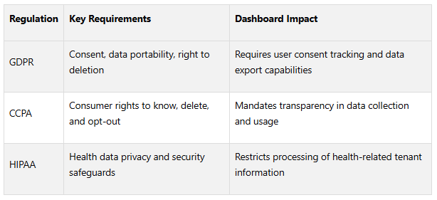
Non-compliance can be costly. For example, GDPR violations can result in fines of up to 4% of annual global revenue, and other regulations carry similarly hefty penalties.
Data privacy laws like GDPR, CCPA, and HIPAA impose strict requirements on how personal data is collected, processed, and stored. Real estate dashboards often include tenant records, employee information, and investor details, all of which may fall under these regulations. Proactive measures like pseudonymization have been shown to improve compliance rates by 30%.
In addition to privacy laws, industry-specific regulations add another layer of complexity. For instance, securities regulations dictate how investment performance is reported, while financial reporting standards govern how certain metrics are defined and disclosed. Real estate licensing rules may also restrict the type of information shared with different stakeholders.
Automated compliance tools can help organizations stay ahead of evolving regulations. These systems flag potential violations, generate required reports, and maintain audit documentation.
Regular compliance audits are essential to evaluate both technical controls and operational procedures. Organizations with dedicated compliance teams experience 25% fewer regulatory breaches, highlighting the value of specialized expertise. These audits should review data handling practices, access controls, retention policies, and incident response plans.
Vendor compliance is another critical area. Your third-party providers - such as cloud hosting services or analytics platforms - must meet the same regulatory standards as your internal systems. Regular assessments of these vendors ensure your compliance efforts extend across your entire technology stack.
Integrated platforms like CoreCast not only simplify compliance but also provide real-time insights, helping organizations maintain trust and make informed decisions.
Conclusion: Building Effective Stakeholder Dashboards
Creating real-time stakeholder dashboards that truly work means finding the right balance between technical functionality and user needs. Start by identifying clear, actionable metrics that align with stakeholder goals - whether it's investors keeping an eye on portfolios or operators managing daily property performance.
Once those goals are set, the next step is ensuring your data is both integrated and always up-to-date. Pull together information from multiple sources and automate updates to provide reliable, current data. Strong validation processes and automated workflows help eliminate errors, boosting stakeholder confidence in the information they’re using.
The design of the dashboard plays a huge role in its effectiveness. A clear, user-friendly layout with intuitive navigation and tailored views for different roles ensures users can quickly find the information they need - whether they’re in the office or checking on their mobile devices.
At the same time, data quality, security, and compliance must remain top priorities. Implement strict access controls, encryption, and maintain audit trails to protect sensitive information and meet regulatory requirements.
For those looking for a comprehensive solution, CoreCast provides a powerful platform. It’s an all-in-one real estate intelligence system that combines data integration, streamlined workflows, and custom role-based views into a single platform. Starting at $50 per user per month during its beta phase, CoreCast simplifies tasks like underwriting, pipeline tracking, portfolio analysis, and stakeholder reporting.
Finally, dashboards aren’t a “set it and forget it” tool - they require ongoing feedback and updates. Regularly gathering input from users, monitoring performance, and adapting to changing needs ensures your dashboards remain a trusted resource that drives smarter decisions and maintains stakeholder confidence. By combining clear metrics, seamless workflows, and strong security, you’ll create dashboards that deliver long-term value.
FAQs
-
To choose the right metrics for stakeholders, begin by understanding their unique goals and the decisions they need to make. Pinpoint the insights they rely on to assess performance, monitor progress, or make informed choices. Design the dashboard to emphasize key metrics that directly connect to their objectives, presenting the information in a way that's clear and actionable.
It's important to periodically revisit and adjust these metrics to keep them aligned with shifting organizational priorities and stakeholder needs. A thoughtfully crafted dashboard should deliver easy-to-understand, real-time insights that improve communication and support better decision-making for everyone involved.
-
To keep data secure and ensure compliance in real-time stakeholder dashboards, begin by setting up strict access controls paired with multi-factor authentication. This ensures that only authorized personnel can access sensitive data. Adding encryption for data both at rest and in transit provides another critical layer of protection against breaches or unauthorized interception.
It's also essential to perform regular security audits and stay aligned with regulations like GDPR, CCPA, or other applicable standards. Taking these proactive steps not only protects stakeholder information but also ensures adherence to U.S. data privacy and security laws.
-
Automating data updates takes real-time dashboards to the next level by ensuring they consistently display the most current and accurate information. This approach not only minimizes the chances of human error but also removes the delays that come with manual data entry. The result? Faster, more dependable decision-making.
When updates are automated, businesses can react swiftly to changing circumstances, simplify their workflows, and make decisions grounded in reliable data. This kind of efficiency is particularly important in industries like real estate, where having timely insights can influence investment strategies and improve communication with stakeholders.