
Common Mistakes in CRE Market Trend Visuals
Bad visuals in commercial real estate (CRE) can lead to poor decisions, lost opportunities, and financial errors. Misleading charts, cluttered designs, and missing context confuse stakeholders and obscure key trends. Avoid these pitfalls by:
Choosing the right chart types: Use line charts for trends, bar charts for comparisons, and avoid pie charts for detailed data.
Simplifying visuals: Limit data per chart, reduce clutter, and use consistent colors and labels.
Providing context: Include timeframes, locations, and reliable data sources to ensure clarity.
Avoiding short-term focus: Long-term data reveals patterns and reduces reactionary decisions.
Using expert tools: Platforms like CoreCast offer real-time insights, while expert analysts ensure precision.
Quick takeaway: Clean, accurate, and well-contextualized visuals build trust, improve decision-making, and reflect professionalism in CRE presentations.
5 Common Data Visualization Pitfalls and How to Fix Them
Using Wrong Chart Types
Choosing the wrong chart type can skew your data’s message. For commercial real estate professionals, poor visualization choices can misrepresent market trends, leading to misinformed decisions and missed opportunities.
Chart Type Mistakes
Pie charts for comparisons are a common pitfall. Imagine using a pie chart to compare vacancy rates across five office markets. When slices are close in size - like 12% and 14% - the visual difference is negligible, even though the financial implications could be massive.
Line charts for unrelated data can also mislead. For example, a developer once used a line chart to display rent growth across different property types - office, retail, industrial, and multifamily. By connecting these categories, the chart suggested a relationship that didn’t exist, confusing the audience.
Bar charts for time-based trends often fail to convey the bigger picture. Treating each month as a separate entity can obscure patterns like seasonality or market momentum, making it harder to identify whether conditions are improving or declining.
Beware of flashy chart formats, too. A 3D pie chart may look impressive, but perspective effects can distort proportions. A segment that appears to represent 15% might actually be closer to 8%, leading to overestimations or poor strategy.
Now, let’s look at how to align your chart choice with your data.
How to Pick the Right Chart
The right chart type depends on your data and your audience. The goal is to choose a visualization that clearly communicates your message.
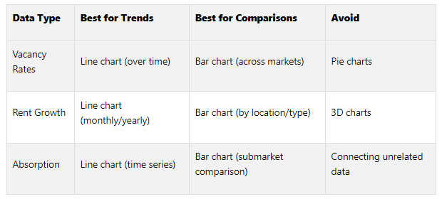
Vacancy rates: Use line charts to show trends over time. For comparisons across markets or property types, bar charts are more effective. Avoid pie charts, as they obscure small but meaningful differences.
Rent growth: Line charts work well for tracking changes over time, while bar charts are better for comparing growth percentages across cities or sectors during the same period.
Absorption trends: Time-based data benefits from line charts, which reveal patterns like seasonal fluctuations or market shifts. For comparing submarkets or property types, bar charts are the way to go.
For geographic data, heat maps are particularly effective. They can highlight high-rent or low-vacancy areas across neighborhoods or regions, making it easier to identify promising opportunities.
Consistency in visual cues is equally important. Research by Cleveland and McGill shows that certain visual elements are easier to interpret than others. Position along a common scale ranks highest in accuracy, followed by length, angle, and area. This explains why bar charts, which rely on length and position, often outperform pie charts, which depend on angles and areas.
Tailor your charts to the context. Detailed reports can handle complex visuals, but slides for presentations should be straightforward. Also, consider your audience: seasoned investors may appreciate more intricate charts, while potential clients might prefer simpler comparisons.
Consistency builds trust. If you use blue bars to represent office properties in one chart, stick with that color throughout your presentation. This continuity helps your audience process information quickly and accurately.
For example, the industrial vacancy rate’s slight dip to 8.5% in May 2025 contrasts with the challenges facing the office sector. By using consistent chart types and formatting, you make it easier for viewers to compare data across property types and draw meaningful conclusions. Following these practices ensures your charts reflect market realities and support sound investment decisions.
Cramming Too Much Data into One Visual
Packing a single chart with too many metrics creates a cluttered mess that makes it hard for stakeholders to grasp the key takeaways from your market analysis.
Problems with Overloaded Visuals
People can only process so much at once. If you try to cram vacancy rates, rent growth, absorption data, and cap rates all into one chart, you’re setting up your audience for confusion. Instead of understanding the story, they’ll struggle to figure out what’s important.
Too many gridlines, overlapping labels, and competing design elements only add to the problem. According to a Gartner survey, poor data quality and misinterpretation can cost businesses up to $15 million each year.
Take a pie chart with too many slices, for example. Imagine trying to show market share across 12 office submarkets, all with similar colors and crowded labels. It becomes nearly impossible to pinpoint useful insights. A viewer likely won’t notice the difference between segments representing 8% and 12% of the market - even though that gap could mean significant dollars.
Heat maps can also go wrong when they use clashing colors. Bright, conflicting shades without clear labels or legends leave the audience guessing what each color means. Instead of focusing on market opportunities, stakeholders waste time trying to decode the visual.
Mixing multiple narratives in one chart is another common mistake. For instance, trying to show both historical trends and future projections for various property types in a single visual can muddle the message. Viewers may not know which timeframe or data set deserves their attention.
The consequences go beyond confusion. When investors or lenders can’t quickly understand your analysis, they might question your expertise or, worse, miss out on critical opportunities.
To avoid these pitfalls, focus on cleaning up your visuals.
Ways to Simplify Your Visuals
The first step to decluttering is narrowing your focus. Stick to one key message per chart and split complex data across multiple visuals. This makes it easier for your audience to absorb the information and come to clear conclusions.
Simplify design elements by cutting unnecessary gridlines, using fewer colors, and cleaning up labels. If a pie chart gets too crowded, switch to a bar graph - it’s often a more effective way to compare values.
Limit your color palette to just a few distinct shades, and always include a clear legend. Instead of using 12 different colors for submarket data, group similar areas together and use variations of 3–4 main colors. This creates a visual hierarchy that’s easier to follow.
Consider progressive disclosure: start with high-level trends, then dive into the details with additional visuals. This mirrors how most people process information - from the big picture to the specifics.
For digital presentations, add filtering options. Let viewers toggle between property types, timeframes, or regions, so they can focus on what’s relevant without being overwhelmed by everything at once.
Finally, guide your audience’s attention with a clear visual hierarchy. Highlight key data points using bold text, larger fonts, or contrasting colors. Don’t forget the importance of white space - strategic spacing helps viewers process information more effectively and gives your charts a polished, professional look.
Poor Design Choices That Confuse Viewers
Bad design can muddy the waters of CRE data, leaving stakeholders scratching their heads instead of gaining clarity.
Common Design Problems
Inconsistent color schemes disrupt the flow of CRE presentations. When colors don’t follow a pattern, viewers spend more time decoding visuals than absorbing market insights.
Poor font choices can make your analysis look amateurish and hard to follow. Overloading a presentation with multiple or overly decorative fonts creates unnecessary clutter.
Unclear labels leave viewers guessing. Imagine a chart with rising lines but no axis labels or legend - are those numbers rental rates, square footage, or occupancy percentages? Without context, your audience is left in the dark.
Low-contrast colors are another culprit. Light gray text on a white background or bright yellow on orange can be almost unreadable, especially on different screens or devices.
Misaligned elements give off a sloppy vibe. Whether it’s uneven chart titles or inconsistent spacing, these errors suggest a lack of attention to detail, which can undermine trust in your analysis.
Overuse of decorative elements distracts from the data. Borders, shadows, 3D effects, and excessive graphics compete for attention, making it harder to focus on the key points.
Design Rules for Clear Visuals
To avoid these pitfalls, stick to some tried-and-true design principles.
Create a consistent brand style guide that outlines your color schemes, fonts, and design elements. Limit yourself to two or three fonts across your presentation to keep things professional and easy to read.
Use color theory wisely by choosing one main color and two complementary accent colors. Apply them consistently to create harmony and make data relationships easier to grasp.
Prioritize contrast and readability by ensuring text stands out clearly against its background. Test your visuals on various devices to make sure they’re legible everywhere, from monitors to tablets.
Establish a visual hierarchy with consistent font sizes and bold text for key insights. This helps guide your audience through your analysis while keeping supporting data in the background.
Leverage white space to keep your visuals clean and approachable. Proper spacing around charts and between elements makes it easier for viewers to process information without feeling overwhelmed.
Choose the right file formats for your presentation. For example, use JPEG for photos, PNG for images needing transparency, SVG for scalable graphics, and PDF for print materials. Save high-resolution images - double the normal size for retina displays - to ensure clarity.
Align elements properly by using grid systems or alignment tools in your design software. When everything is neatly arranged, your presentation feels polished and reliable.
Keep text short and to the point to avoid overwhelming your audience. Use clear headlines and subheadings to organize information, making it easy for busy professionals to find the insights they need.
Transform Your Real Estate Strategy
Access expert financial analysis, custom models, and tailored insights to drive your commercial real estate success. Simplify decision-making with our flexible, scalable solutions.
Missing Context and Wrong Data
Without context, data can leave out crucial details, leaving decision-makers in the dark.
What Happens When Context is Missing
Timeframes can be misunderstood when commercial real estate (CRE) professionals present market data without clearly defining the dates. Imagine a chart showing rising office rents - it might look alarming if it spans 20 years and includes outdated figures that no longer reflect current trends.
Location specifics are left out, making it hard for stakeholders to gauge whether a 15% vacancy rate signals a typical market fluctuation or a critical issue. The impact of such a number can vary dramatically depending on the property type and location.
Data sources vanish in many presentations, leaving audiences unable to verify the accuracy or methodology. For instance, if you're analyzing cap rate trends, not knowing whether the data comes from a reputable provider or internal records can undermine trust in the analysis.
Visuals lack essential context, which can mislead viewers about dramatic market changes. A sudden spike in industrial property values, for example, is far more meaningful when paired with explanations about an e-commerce boom or supply chain disruptions driving the change.
Demographics are oversimplified, often showing population growth without breaking down critical details like age groups, income levels, or employment sectors. Without these specifics, investors lack the insights they need to make informed decisions.
Just as the design and choice of charts impact clarity, providing full context ensures that market analysis is both trustworthy and actionable.
“The time when brokers could lean on gut feelings to get the best deal is gone. Today, if you’re not paying attention to the numbers, you’re losing money.”
Adding context to every data point transforms raw numbers into clear, actionable insights.
Making Sure Your Data is Right
Fixing missing context is just one part of the equation - ensuring the data itself is accurate is equally important.
Cross-check your sources to identify inconsistencies or outliers that could skew your analysis.
Understand data collection methods. Knowing whether the data comes from voluntary reporting or public records can explain variations in market metrics.
Check publication dates. Real estate markets move fast, so outdated data can lead to poor decisions. Always use the most current information, especially in volatile markets.
Keep your sources documented. Transparency builds trust and allows others to verify your findings.
Refresh your data regularly. Setting a schedule for updates prevents reliance on stale information that could lead to missed opportunities.
Compare findings with local expertise. Local brokers, property managers, and market participants can provide valuable insights to spot gaps or anomalies in the data.
Show confidence intervals. When presenting projections or estimates, including uncertainty ranges shows professionalism and helps stakeholders gauge reliability.
Test for consistency. Look for logical relationships between metrics. For example, if vacancy rates are climbing but rents are also increasing, dig deeper to understand the market dynamics at play.
Ignoring Long-Term Trends and Cherry-Picking Data
A common pitfall in commercial real estate analysis is focusing only on recent data or cherry-picking numbers to fit a specific narrative. While the data itself may be accurate, this approach can lead to misleading conclusions and poor investment decisions.
Just like using unclear charts or overcrowded visuals, relying solely on short-term data distorts the broader market story.
Short-Term vs. Long-Term Data
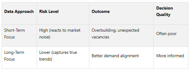
Short-term data often masks important trends that even seasoned professionals can overlook. Looking at just six months or a year of data provides a narrow snapshot, missing the bigger picture.
Market volatility highlights the danger of this approach. For example, a sudden three-month spike in vacancy rates might appear alarming. But when viewed over five years, it could simply reflect a seasonal pattern or temporary disruption. Consider this: over 30% of new commercial spaces in crowded U.S. markets faced extended vacancies because investors misjudged long-term demand, reacting too quickly to short-term shifts.
Long-term data, on the other hand, filters out short-term noise and reveals real patterns. For instance, U.S. Census Bureau data from 2010 to 2020 uncovered major demographic changes, like millennials and retirees moving to the suburbs. These shifts would have been missed by focusing only on recent urban trends.
Taking a long-term view allows you to identify recurring cycles, structural changes in work and living habits, and demographic trends that reshape entire markets. These insights are invaluable for making smarter, more strategic investment decisions. Here's a quick comparison:
Staying Objective with Your Data
Choosing the right timeframe is just one part of the equation. Maintaining objectivity in your analysis is equally critical. Cherry-picking data - selecting only the figures that support a preferred narrative - can create a false sense of confidence and blind you to actual market risks.
Using multiple data sources helps avoid bias by revealing conflicting signals. For instance, if one dataset shows rising rents but another highlights growing concessions, digging deeper into the discrepancies provides a fuller picture.
Seeking independent feedback is another way to challenge your assumptions. Colleagues or external experts can review your analysis and uncover blind spots you might miss on your own.
Regular updates are essential to staying relevant. Real estate markets move fast, and trends that seemed reliable six months ago might have already shifted. Automating data refreshes or scheduling regular reviews ensures your analysis remains up-to-date.
Transparency in your methodology builds trust. Clearly documenting your data sources, timeframes, and decision-making process allows stakeholders to better understand and evaluate your conclusions. It also helps you spot and correct any biases in your own analysis.
The key to objective analysis is actively seeking information that challenges your initial assumptions. While this requires more effort upfront, it significantly reduces the risk of costly mistakes later.
For commercial real estate professionals, objective and comprehensive analysis is non-negotiable. Companies like The Fractional Analyst offer financial analysis and market research services tailored to this need. Their CoreCast platform combines expert insights with user-friendly tools to help professionals analyze both short-term and long-term trends while minimizing bias and misinterpretation risks.
Using Professional Tools and Expert Help
When it comes to creating accurate and impactful visuals, relying on advanced tools and expert insights can make a world of difference. Did you know that basic spreadsheet errors impact 90% of financial models, leading to flawed analysis? This is where professional tools and expertise set apart seasoned professionals from those just starting out.
Many commercial real estate (CRE) professionals try to manage everything internally, but this often results in the very errors we’ve been discussing. Knowing when to seek external expertise or use specialized tools can save time, reduce mistakes, and elevate the quality of your work.
Expert Service vs. Self-Service Options
The Fractional Analyst offers two distinct solutions: expert-driven services and self-service tools. Each option is tailored to meet different needs, depending on the complexity of the task at hand.
Expert services are designed for situations requiring precision and deep customization. Spencer Vickers, who has underwritten over $20 billion in deal volume and supported over $5 billion in assets, leads a team of financial analysts with extensive experience. These experts handle tasks like complex underwriting, market research, and investor reporting, ensuring every detail is accounted for.
On the other hand, self-service tools like CoreCast put the power in your hands while maintaining professional standards. CoreCast consolidates your data into a dynamic dashboard, eliminating the manual updates and static nature of traditional Excel models. This tool is perfect for routine analysis and portfolio monitoring, offering real-time updates and insights.
Here’s how the two options compare:
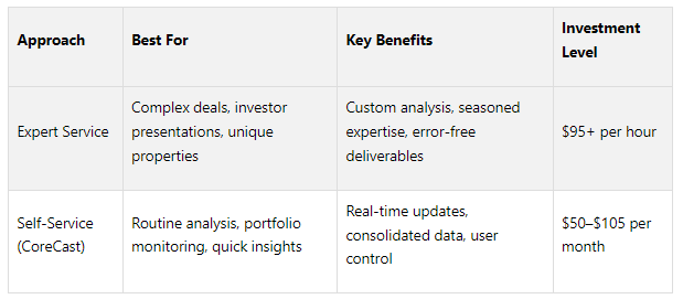
The choice between these depends on your specific needs. For unique property types, intricate financing structures, or high-stakes investor presentations, expert services are invaluable. Meanwhile, self-service tools are ideal for day-to-day tasks and quick insights.
Using Free Financial Models
For professionals looking to get started or refine their skills, The Fractional Analyst also offers free downloadable financial models. These templates are excellent for commercial real estate analysis, providing a solid foundation for presenting data effectively.
The library includes templates for multifamily acquisitions, mixed-use developments, and IRR matrices. These models are carefully designed to avoid common visualization errors, such as cramped layouts or unclear charts. With built-in formatting and logical data organization, they make trends easy to understand and act upon.
Free models are especially helpful for smaller firms or independent professionals who need polished outputs without the expense of custom analysis. They’re also great for scenario analysis, allowing users to adapt proven frameworks to their specific needs without starting from scratch. This minimizes errors while maintaining professional standards.
Additionally, these templates double as training tools. Junior team members can study how experienced analysts structure data and avoid pitfalls like overcrowded visuals or misleading time frames. By learning from these examples, teams can improve their overall presentation quality.
Whether you’re leveraging free resources, using self-service tools like CoreCast, or relying on expert services, there’s a solution for every level of need. Together, these options ensure your data is always presented in a way that supports informed and confident investment decisions.
Conclusion
Creating effective visuals for commercial real estate market trends requires steering clear of key mistakes that can mislead decision-makers. These errors don't just undermine professionalism - they can also distort crucial insights.
Good data visualization transforms complex information into clear, actionable insights. This is especially important in the fast-moving world of commercial real estate, where trends evolve quickly, and investment decisions often involve large financial stakes.
The Fractional Analyst tackles these challenges head-on with a combination of expert services and user-friendly tools. Their team of financial analysts ensures that even the most intricate data is presented with clarity. Meanwhile, their CoreCast platform consolidates real-time data, overcoming the static limitations of traditional Excel models and reducing the risk of visualization errors. For those just getting started, the free financial models they offer are a great resource, with built-in formatting and logical layouts that help avoid common issues like overcrowded visuals or unclear charts. These solutions not only address frequent pitfalls but also position users to adapt to future market changes.
Considering that 92% of C-suite leaders believe AI will transform the workforce within the next five years, and 90% of organizations plan to ramp up AI investments, having access to professional-grade tools has never been more important. Whether you choose tailored expert analysis or CoreCast’s self-service tools (priced between $50 and $105 per month), you’re equipping yourself with the resources needed to make confident, data-driven investment decisions.
FAQs
-
Choosing the right chart type plays a big role in making data from the commercial real estate (CRE) market easy to understand. Line charts and area charts are great for showing trends over time, like changes in rental growth or vacancy rates. If you're comparing property metrics - like square footage or lease terms across different assets - bar charts or column charts are your go-to options. For anything tied to location, geographic maps are perfect for exploring property distribution or market demographics.
When dealing with metrics that have different units or scales, dual-axis charts can help you display the data side by side without losing clarity. Picking the right chart ensures your data communicates a clear and accurate story, avoiding common visualization mistakes. A little extra effort in fine-tuning your visuals can make your insights more impactful and easier to act on.
-
To craft clear and impactful CRE data visuals, start by pinpointing the purpose of your visualization and considering who will be viewing it. Incorporate visual tools like charts, heatmaps, or infographics to spotlight essential metrics, such as leasing trends or investment outcomes. Structure your data in a logical way and select chart types that effectively communicate the story behind your numbers.
Use color, size, and other visual elements strategically to draw attention to key insights, helping your audience interpret the data quickly. Keep your visuals clean and uncluttered so that the main points stand out. A well-designed visualization not only makes the data easier to understand but also helps convey market trends with accuracy and clarity.
-
To make complex data in commercial real estate visuals easier to understand and keep your audience engaged, focus on highlighting the most important metrics and trends. Use simple, clear visuals like bar or line charts that showcase key patterns without cluttering the design with unnecessary details. Breaking information into smaller, manageable sections and applying visual hierarchy - such as bold colors or larger fonts for critical points - can help your presentation stand out.
It's also important to avoid cramming too much information into your visuals. Stick to a straightforward narrative, including only the data that directly supports your main message. A well-thought-out design ensures your stakeholders can quickly absorb the insights that truly matter.