
How to Design Dashboards for Different Stakeholders
When designing dashboards, a one-size-fits-all approach doesn’t work. Different stakeholders - like investors, operators, and analysts - have unique goals and data needs. A well-designed dashboard simplifies decision-making by focusing on what matters most to each user. Here’s the key takeaway:
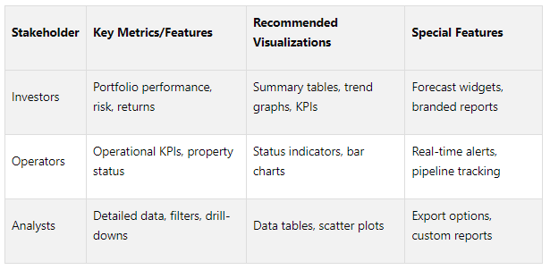
Investors need high-level metrics like portfolio performance, risk exposure, and growth trends. Use summaries, visual cues, and branded reports to deliver quick insights.
Operators rely on real-time property-level data for occupancy rates, maintenance schedules, and expenses. Highlight actionable data with alerts and interactive maps.
Analysts require detailed, drill-down data for trend analysis and modeling. Provide advanced filtering, export options, and customizable reports.
To create effective dashboards, start by understanding stakeholder requirements through interviews, workshops, and feedback. Then, apply design principles like clarity, logical layouts, and consistency. Platforms like CoreCast streamline this process by offering centralized data integration and role-specific tools.
Key Stats:
Tailored dashboards improve decision-making speed by up to 46%.
Over 70% of business leaders report better results with customized insights.
The right dashboard delivers the right data to the right person, enabling faster and smarter decisions.
Align with Business Stakeholders On Your Next Dashboard
Understanding Stakeholder Requirements
Before diving into dashboard creation, take the time to understand your users and their goals. This goes beyond simply asking what data they want to see - it’s about uncovering their daily challenges, decision-making processes, and definitions of success. A well-thought-out approach ensures the dashboard becomes a daily tool rather than something overlooked.
The next step is identifying the main stakeholder groups to customize the dashboard’s features to meet their specific needs.
Identifying Key Stakeholder Groups
In real estate organizations, stakeholders generally fall into three main groups, each with distinct roles and data requirements:
Investors: Their focus is on portfolio performance, returns, and risk management. They make strategic decisions about acquisitions, dispositions, and capital allocation. With limited time, they need high-level insights - visual summaries that quickly provide the big picture.
Operators: These are the people managing day-to-day property and portfolio operations. They monitor occupancy rates, maintenance schedules, tenant relations, and expenses. Their decisions are immediate and tactical, requiring real-time data to address issues and ensure smooth operations.
Analysts: Analysts dive into the details, studying market trends, financial models, and performance metrics. Their work supports investment decisions through detailed research and reporting. They need granular data with options to drill down and export for deeper analysis.
Understanding these roles prevents the common pitfall of creating generic dashboards that fail to meet anyone’s needs.
Mapping Stakeholder Goals and Data Needs
Each stakeholder group has unique goals, which directly shape their data preferences:
Investors prioritize portfolio-level metrics like total returns, cash flow trends, and risk exposure across asset classes. They prefer visual summaries, such as charts showing performance over time, geographic asset distribution, and key performance indicators (KPIs) that are easy to grasp.
Operators require property-level details with real-time updates. They want clear insights into vacant units, upcoming lease expirations, maintenance requests, and budget variances. Their dashboards should highlight actionable data and allow them to zoom in on specific issues or properties.
Analysts need comprehensive access to data, along with the flexibility to manipulate and export it. This includes historical trends, comparable property data, and market benchmarks. Customization options are crucial, enabling them to dig into the numbers behind summary metrics.
“Every dashboard needs to tell a story visually, so we work with stakeholders to determine a common end goal and work backward from there, making metric suggestions that can all help keep the ‘story’ on track.”
With these goals in mind, the next step is gathering detailed input to guide the design process.
Collecting Requirements
A structured approach is key to uncovering the workflows and decision-making needs of your stakeholders. Start with stakeholder interviews to understand their daily routines and decisions. Ask questions like, "What decisions do you make weekly?" or "What information do you need immediately?"
Workshops can also be highly effective. Bringing representatives from different groups together encourages collaboration and helps identify shared metrics that can serve multiple audiences.
“We have found that the best way to identify dashboard requirements is to start with the end goal. What are we trying to accomplish with this dashboard?”
Using stakeholder mapping tools can help categorize individuals based on their influence, interest, and impact on the dashboard’s success. For example, property managers might have high influence and interest, requiring close collaboration, while external investors may have high interest but less day-to-day involvement, needing regular updates.
Surveys are another useful method for gathering input, especially from larger groups. Focus these surveys on specific scenarios rather than broad preferences. Providing mock-up examples and asking stakeholders to rank their usefulness can lead to actionable feedback.
Establishing a feedback loop early in the process is essential. Share initial designs and invite input before committing to a full build. This iterative approach minimizes expensive redesigns and ensures the final product aligns with real-world needs.
Keep in mind that stakeholder requirements often evolve. As users see what’s possible, their expectations may shift. Rather than simply collecting feature requests, aim to address the underlying business challenges they face. This approach ensures the dashboard remains relevant and impactful over time.
Core Dashboard Design Principles
Once you understand what your stakeholders need, the next step is to apply design principles that turn raw data into meaningful, actionable insights. A well-designed dashboard isn’t about cramming in every metric - it’s about focusing on the essentials that help users make faster, smarter decisions.
Clarity and Focus
The golden rule for dashboards? Less is more. A great dashboard tells a clear story without overwhelming users. Stick to the most relevant metrics and make sure the most critical insights are front and center.
Users should grasp the dashboard's main message within five seconds. If they can't, there's probably too much information competing for attention. Highlight data that directly supports decision-making, and avoid clutter.
Visual hierarchy plays a big role here. Use size, color, and placement to guide attention to the most important information. Key performance indicators (KPIs) should be prominent - typically at the top or in the largest visuals. Less critical metrics can be smaller and positioned lower or to the side.
Eliminate decorative elements that don’t serve a purpose. Every chart, number, or icon should earn its place. If a metric doesn’t align with your stakeholder’s goals, it’s better to leave it out.
Use progressive disclosure to balance simplicity and detail. For example, show a high-level summary like portfolio performance upfront, but let users click through for deeper insights, such as individual property details.
Finally, arrange your dashboard to match how stakeholders naturally process decisions.
Logical Layout and Navigation
Your dashboard layout should feel intuitive, aligning with how users naturally scan and process information. Most people read from left to right and top to bottom, so position the most critical data accordingly.
Group related metrics together to create logical sections. For instance, you could cluster financial data in one area, operational stats in another, and market comparisons in a third. This helps create a clear narrative.
Ensure navigation is seamless. Summary KPIs should link to more detailed charts and breakdowns. Filters and menus should be easy to find and consistent across all dashboards, minimizing the learning curve.
Surprisingly, asymmetrical layouts can work better than rigid grids. By letting the importance of the data dictate the size and placement of elements, you can naturally guide users’ focus.
Think about the decision flow of your audience. If an investor typically checks overall returns first, then looks at geographic distribution, and finally reviews asset performance, your dashboard should follow that same sequence.
A thoughtful layout also sets the stage for consistent styling and accessibility.
Consistency and Accessibility
Consistency makes dashboards easier to navigate and reduces cognitive effort. Establish clear formatting, color schemes, and visualization standards, and apply them consistently across all dashboards.
Develop a color palette with purpose. Use bright colors sparingly for highlights or alerts, and ensure high-contrast combinations for readability. For example, green can indicate positive trends, while red signals negatives. But don’t rely solely on color - add icons or patterns to reinforce meaning for users with visual impairments.
Font consistency is just as important. Use the same font styles and sizes for similar elements across all dashboards. Headers, body text, and labels should look uniform to avoid confusion.
Stick to familiar chart types. Line charts are great for trends over time, bar charts work well for comparisons, and overly complex visuals should be avoided unless absolutely necessary. Users shouldn’t have to think about how to interpret a chart.
Make your dashboards accessible to everyone. Include keyboard navigation options and ensure charts are compatible with screen readers. Use clear labels and provide context for numbers by including benchmarks or comparison periods.
Icons can make dashboards more user-friendly, especially for non-technical users. They act as quick visual cues and can replace text labels in some cases, reducing clutter.
Lastly, simplify your numbers. Round them off to highlight meaningful changes. For instance, "23.7%" is easier to digest than "23.6847%" - and the extra decimal places rarely add value to decision-making.
Building Dashboards for Different Stakeholder Groups
Once you've nailed down the design principles, it's time to bring them to life. The challenge? Every stakeholder group processes information differently. They make decisions at varying speeds and need dashboards tailored to their unique perspectives. According to a 2024 survey by Domo, over 70% of business leaders consider dashboards crucial for decision-making, yet only 38% feel their dashboards meet their needs. This disconnect underscores why generic dashboards often fall short. Let’s dive into how to create dashboards that resonate with investors, operators, and analysts.
Dashboards for Investors
Investors are all about the big picture - and they want it fast. With multiple investments to monitor, they need a quick read on performance, risks, and what lies ahead. Their dashboards should answer three key questions: How is my money performing? What risks exist? What can I expect next?
Start with a clear display of portfolio performance: metrics like total value, IRR (internal rate of return), and cash-on-cash returns. Add visual cues like gauges or heatmaps to highlight risk exposure by geography, asset class, or market conditions. For example, a heatmap showing regional risks can provide immediate insights.
Forecasted returns are another must-have. Widgets that show projections based on current trends help investors plan their next moves. Use summary tables - they’re compact, easy to read, and pack in a lot of information.
Asset allocation deserves special attention. A pie chart breaking down investments by property type, region, or risk profile offers a clear snapshot of exposure. Take it a step further with interactive charts that let investors drill into specific segments for more detail.
Finally, branded reports are a game-changer. Many investors need to share performance updates with their own stakeholders, so providing polished, downloadable reports adds immense value.
Dashboards for Operators
Operators, on the other hand, thrive on detailed, real-time data. They need metrics that directly impact property performance and operational efficiency - right here, right now.
Start with property-level occupancy rates. Use color coding to flag properties that need attention, like those below 90% occupancy. A simple bar chart showing occupancy rates across properties makes it easy to spot outliers. And for properties underperforming, consider automated alerts.
Rent collection is another critical focus. Show current collection rates alongside historical trends, and highlight properties with declining performance. A dashboard with real-time indicators - complete with red flags for underperforming properties - ensures nothing slips through the cracks.
Maintenance metrics like ticket volume and response times are vital for managing service quality. Visuals like gauges can track open tickets, average resolution times, and overdue items. For example, a gauge showing the percentage of tickets resolved within 24 hours gives a quick sense of team efficiency.
Pipeline tracking is essential for acquisitions or development projects. A funnel visualization can show the progress of deals, helping operators prioritize tasks and identify bottlenecks.
Operators also benefit from real-time alerts for critical issues like sudden drops in occupancy, maintenance emergencies, or upcoming lease expirations. These alerts should be prominent but not overwhelming.
Interactive maps are another powerful tool. By integrating property locations, performance metrics, and competitive landscapes on a single map, operators can make informed decisions quickly.
The layout should prioritize ease of use. Since operators check dashboards frequently throughout the day, the most critical data should be front and center, requiring minimal scrolling or clicking.
Dashboards for Analysts
Analysts need depth, flexibility, and tools to dissect data from every angle. Their dashboards should offer access to raw data while supporting advanced analysis and reporting.
Start with detailed data tables. Unlike the summary views investors and operators rely on, analysts need transaction-level details, property-specific metrics, and historical data. These tables should be sortable and filterable by multiple criteria.
Advanced filtering is essential. Analysts should be able to segment data by date range, asset type, region, or other dimensions. According to a 2023 Geckoboard report, dashboards with clear hierarchies and grouped metrics improve task completion speed by 27%. This is particularly relevant for analysts navigating complex datasets.
Drill-down capabilities are another must. Analysts should be able to move seamlessly from high-level summaries to granular data. Additionally, export options (CSV, Excel, PDF) enable deeper offline analysis.
Cohort analysis and time-series breakdowns help analysts uncover trends and patterns, like performance variations across acquisition vintages or seasonal shifts in occupancy rates.
Custom reporting tools allow analysts to create and save tailored views for specific projects or research questions. Sharing these views with team members enhances collaboration and efficiency.
Visualization flexibility is critical. While investors may prefer simple, clean visuals, analysts often benefit from advanced chart types like scatter plots or correlation matrices, which reveal deeper relationships in the data.
For analysts, functionality trumps aesthetics. Comprehensive filters, customizable workspaces, and multiple view options take precedence over visual flair.
Key Metrics and Visualizations by Stakeholder
Here’s a quick summary of the priorities and tools for each group:
The best dashboards recognize that stakeholder needs often overlap. A property manager might require both operational insights and analytical depth, while an investor might occasionally want to dig into specific property details. The key is designing dashboards that meet core needs while offering pathways to explore additional information when necessary.
Using CoreCast's Platform Features
Making the most of cutting-edge design principles requires a platform that can handle complexity with ease, and CoreCast delivers exactly that. Its integrated platform brings together various data sources, allowing real estate professionals to create dashboards that are both accurate and visually clear - all without the hassle of switching between multiple tools.
Centralized Data Integration
CoreCast consolidates real estate operations into a single, user-friendly dashboard. Whether you're underwriting assets across different classes and risk profiles, tracking deals through various stages, or analyzing property portfolios alongside competitors, everything happens in one place. This unified approach ensures stakeholders always have consistent and reliable data.
For investors, portfolio dashboards automatically pull live data from underwriting models, pipeline updates, and market analytics. As deals move through stages, performance metrics update instantly. Operators benefit from mapping tools that overlay property performance with competitive intelligence. For instance, a property manager can view occupancy rates alongside local market trends on a single map, enabling quicker, smarter decisions based on location data.
Analysts, on the other hand, gain access to rich historical datasets. The seamless connection between pipeline tracking and portfolio analysis helps them evaluate how pending acquisitions might influence overall performance.
“CoreCast transformed how we communicate portfolio performance to stakeholders. We now spend more time analyzing data, and less time assembling it.”
Custom Stakeholder Reporting
The Key Stakeholder Center makes it easy to create tailored reports for different audiences. Since limited partners, board members, and internal teams often need the same data presented in unique ways, the platform allows users to customize visuals, branding, and layouts. This ensures that every report aligns perfectly with a firm's branding.
For firms juggling multiple stakeholder relationships, branded reporting tools eliminate the hassle of manual report creation. Pre-configured templates auto-populate with up-to-date data, ensuring reports are accurate and consistently formatted - ideal for quarterly investor updates. The platform also supports varied access levels, letting firms offer investors self-service dashboard views while safeguarding sensitive operational data. These tools lay the groundwork for even more advanced features to come, further enhancing dashboard intelligence.
Upcoming Platform Features
CoreCast has big plans for its platform, with enhancements designed to simplify dashboard creation even further. AI-driven automation and advanced reporting tools are on the horizon, bringing features like performance anomaly detection and optimization suggestions based on stakeholder behavior patterns.
The upgraded Key Stakeholders feature will include customizable dashboards, analytics for risk-adjusted returns, and board-ready reporting. Automated Reporting tools will handle tasks like quarterly and annual updates, waterfall calculations, and investor-specific metrics. Additionally, users will be able to model the impact of macroeconomic factors - such as interest rates, inflation, and unemployment - on portfolio returns using machine learning models.
With machine learning integrated into the platform, CoreCast's dashboards will grow smarter over time, adapting to stakeholder interactions. The company aims to scale its platform to over 100,000 users by 2030. These upcoming features promise to build on CoreCast's current strengths, empowering stakeholders with even more precise and intuitive data tools.
Best Practices for Dashboard Performance and Reliability
For dashboards to truly serve their purpose, they need to be dependable, provide meaningful context, and adapt to user needs over time.
Real-Time Data and Update Frequency
Timely and accurate data is the backbone of a reliable dashboard. Stakeholders count on dashboards to reflect the latest information, especially in fast-moving industries like real estate, where outdated data can quickly erode trust.
The key is aligning update frequency with the needs of the users. Operational dashboards, for example, often demand near real-time updates to support quick decision-making. On the other hand, strategic dashboards, which focus on long-term planning, can update less frequently without losing their value. Matching the update cadence to the decision-making context ensures that resources are used wisely while still meeting information demands.
To manage expectations, always display a clear "last updated" timestamp. This simple addition builds trust by letting users know exactly how current the data is.
Adding Context to Data
Timeliness alone isn't enough - data needs context to be actionable. Raw numbers, while informative, often leave users guessing about their significance. Adding context transforms these numbers into insights, helping stakeholders make informed decisions.
For instance, instead of just showing the rental income per square foot of a property, compare it to market averages or its historical performance. This comparison can immediately indicate whether the property is performing well or requires attention.
To further enhance clarity, use visual tools like color coding, annotations, or alerts to highlight metrics that deviate from expectations. These cues guide users directly to areas that need their focus, making the dashboard more intuitive and effective.
Continuous Improvement and Feedback
Even the most well-designed dashboards require regular updates to remain effective. Their success hinges on how well they adapt to real-world usage and stakeholder feedback. Gathering input isn’t just about fixing problems - it’s about understanding what works, what doesn’t, and how to stay ahead of changing needs.
Don’t wait for complaints to roll in. Proactively collect feedback through short surveys, usage analytics, and regular discussions with key users. Ask targeted questions like: Which metrics are most valuable? What’s hard to find? How does the dashboard influence decisions? These insights provide a roadmap for improvement.
“Define your goals before seeking user feedback. Determine what you want to learn and test, including main questions or hypotheses, key metrics, and how feedback will improve your product. Specific and measurable goals guide your feedback strategy and method/tool selection.”
Acting on feedback quickly is just as important as collecting it. Show users that their input matters by implementing changes and communicating those improvements. A centralized system for organizing and prioritizing feedback ensures no valuable insights slip through the cracks. As Valentin Hunag, CEO at Harvestr.io, explains:
“If feedback isn’t centralized, it’s lost. And with it, you lose the opportunity to understand and solve customer problems.”
Combine data from usage analytics with qualitative feedback to get a complete picture of user behavior and concerns. Regularly auditing your dashboard - quarterly reviews work well - helps ensure that metrics stay aligned with business goals and that technical performance remains strong. The best dashboards don’t just react to problems; they evolve to meet future needs.
Conclusion: Building Effective Stakeholder Dashboards
Great dashboards turn raw data into insights that lead to smarter decisions. The secret lies in recognizing that different stakeholders have unique priorities and decision-making needs, which call for customized solutions.
A well-designed dashboard starts with a clear understanding of these specific data needs. By aligning the design with stakeholder priorities, you set the stage for creating tools that truly work for everyone involved.
Sticking to straightforward design principles ensures dashboards are easy to use and actionable. Pair that with reliable, context-rich data that updates at the right intervals, and you’ve got a recipe for building trust and making informed decisions. Platforms like CoreCast take this concept to the next level, offering integrated, role-specific solutions that cater to a variety of user needs.
CoreCast’s platform is a standout example, combining features like asset underwriting, pipeline tracking, and branded reporting into one seamless ecosystem. It supports everything from detailed portfolio analysis to creating custom reports for key stakeholders. With upcoming AI-powered automation and advanced reporting tools, CoreCast is set to make its dashboards even more effective for diverse user groups.
And here’s another crucial piece: feedback. Regularly collecting user input, analyzing usage patterns, and making iterative updates can lead to a 30% boost in customer satisfaction. As data analysis expert John Tukey once said:
“The greatest value of a picture is when it forces us to notice what we never expected to see.”
This idea is at the heart of dashboard design - bringing hidden insights to light.
FAQs
-
Creating dashboards that truly serve stakeholder needs starts with direct communication. Set up meetings or interviews to dive into their goals, the metrics they care about, and how they intend to use the dashboard in their daily workflows. A useful tool here is stakeholder mapping - this helps you categorize and visualize their priorities based on their level of influence and specific requirements.
After gathering all this input, the next step is prioritization. Evaluate which needs align most closely with business objectives and will have the greatest impact. Work closely with stakeholders to confirm you're on the same page and that expectations are clear. This methodical approach ensures your dashboards stay focused, effective, and tailored to what matters most.
-
To ensure dashboards stay useful and impactful, it's important to routinely assess and refresh key metrics and data sources. This helps align the dashboard with shifting business objectives. Gathering feedback from stakeholders is also a smart move - it keeps the dashboard intuitive and ensures it delivers insights that users can act on.
When designing dashboards, build in flexibility. This makes it easier to adjust to new data, shifting priorities, or the specific needs of different users. By taking a proactive and iterative approach, dashboards can remain a powerful tool for driving well-informed decisions.
-
CoreCast simplifies dashboard creation with real-time, fully customizable tools that adapt to the specific needs of different stakeholders, including investors, operators, and analysts. Thanks to its user-friendly interface, it’s easy to design data visualizations that emphasize the most important insights for each audience, ensuring both clarity and relevance.
Beyond dashboards, CoreCast offers a comprehensive suite of features. Users can bring together portfolio insights, monitor deal pipelines, and create polished, branded reports - all within one platform. This streamlined approach ensures that stakeholders receive precise, actionable information, helping drive smarter decisions throughout every stage of the real estate process.