
Why Real Estate Platforms Need Responsive Design
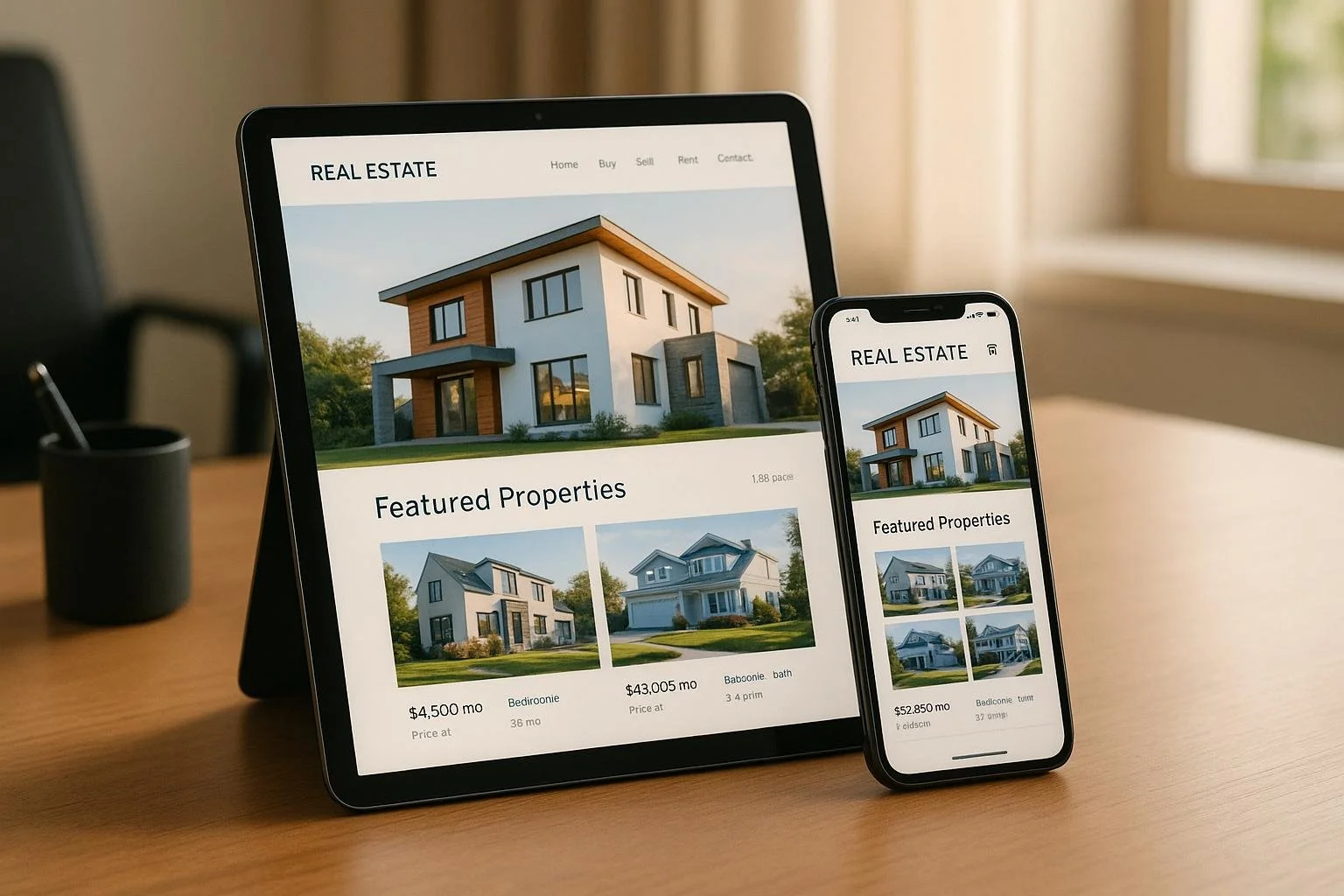
Most real estate searches today happen on mobile devices. In fact, over 70% of property searches are conducted on smartphones, and 72% of homebuyers rely on mobile devices to explore listings. Platforms that don’t work smoothly across all devices risk losing users, as 73% of people leave websites that aren’t mobile-friendly.
Responsive design solves this problem by ensuring platforms adjust automatically to any screen size - desktop, tablet, or smartphone. This creates a consistent experience, reduces bounce rates, and boosts engagement. For example, platforms with responsive design see 35% higher mobile engagement and faster load times, which directly impacts conversions and user satisfaction.
Here’s why responsive design matters:
- User expectations are high: 53% of users leave a site if it takes more than 2 seconds to load.
- Multi-device usage is common: Buyers switch between desktops, tablets, and phones during their property search.
- Search engines prioritize mobile-friendly sites: Non-responsive platforms risk lower visibility on Google.
For real estate professionals, responsive platforms provide instant access to tools like property analytics, deal tracking, and portfolio management - anytime, anywhere. This flexibility not only improves productivity but also ensures platforms remain competitive as new technologies emerge.
Responsive design is no longer optional - it’s the standard for delivering fast, accessible, and user-friendly experiences across devices.
🔥 Nextjs: Building a Responsive Modern Real Estate Website React (2)
How Real Estate Professionals Use Different Devices
The real estate world has seen a dramatic transformation in how both professionals and clients interact with platforms and conduct business. With the rise of mobile technology, the need for platforms to provide smooth, responsive experiences has become more important than ever.
Mobile, Tablet, and Desktop Usage in Real Estate
Today, mobile devices dominate the real estate space. Over 70% of property searches are now conducted on smartphones [5] [9] [7], and leading platforms report that 53% of their traffic comes from mobile users [3]. This marks a sharp turn from the days when desktop computers were the primary tool for property searches.
Responsive websites have proven their worth, achieving 35% higher engagement on mobile devices [9]. Real estate professionals have embraced this shift by tailoring their workflows to different devices: desktops are used in the office for market data and listing updates, smartphones handle client inquiries on the go, and tablets are often the tool of choice for reviewing analytics during meetings [4].
For luxury clients especially, the expectation of instant access to listings and features is non-negotiable. Slow-loading pages or poorly optimized designs can quickly turn them away. The demand for responsive, high-performing platforms has never been higher, and these device trends are reshaping user expectations in ways that directly impact platform performance.
How User Expectations Affect Platform Success
Modern users don’t just prefer mobile access - they demand it. And they expect a seamless experience across all devices. Falling short of these expectations can have real consequences for platforms.
For instance, 53% of mobile users will leave a site if it takes more than two seconds to load, yet the average load time is a frustrating 15 seconds [9]. Poorly formatted property details, excessive scrolling, or the need for constant zooming only add to user dissatisfaction, leading to higher bounce rates [2] [3].
On the flip side, when users encounter a polished, mobile-friendly experience that mirrors what they see on desktops, they’re more likely to stay longer and explore more listings [2] [3]. This extended engagement often leads to higher conversion rates, as users are more inclined to contact agents or schedule property viewings [2]. A great example of this is a leading New York real estate agency, which reported a 35% increase in mobile engagement in 2024 after adopting a mobile-first, responsive design. Users not only spent more time on the site but also completed more inquiries [9].
The reality of multi-device use adds another layer of complexity. Many buyers start their property search on a desktop at work, then continue browsing on a smartphone during their commute or on a tablet at home [4]. Platforms need to ensure that users can switch between devices seamlessly, without losing their place or progress.
Search engine rankings also come into play. Google prioritizes mobile-friendly websites in its search results [5], meaning platforms that aren’t optimized for mobile risk disappearing from view for a large portion of potential users. In today’s competitive market, responsive design isn’t just about keeping users happy - it’s essential for staying visible and relevant. Platforms that fail to deliver consistent, device-friendly experiences risk losing their audience to competitors who understand the importance of accessibility and performance.
Benefits of Responsive Design for Real Estate Platforms
Responsive design does more than just make websites look good on different screens. For real estate platforms, it directly impacts business success, improves user satisfaction, and strengthens their position in today’s mobile-first world.
Consistent Experience Across All Devices
Responsive design ensures that users enjoy a seamless browsing experience, no matter the device. Whether someone is checking listings on their phone during a lunch break, reviewing property photos on a tablet in a meeting, or analyzing detailed data on a desktop in the office, they can access the same functionality without interruptions.
Take CoreCast, for example. Real estate professionals rely on it for tasks like underwriting assets, reviewing portfolio analytics, or tracking deal pipelines. With responsive design, the platform adjusts effortlessly to any screen, enabling smooth navigation and uninterrupted access to tools. No more struggling with zooming or endless scrolling - users can focus on what matters: analyzing properties, tracking deals, and making informed decisions.
Touch-friendly buttons, properly sized interactive elements, and intuitive navigation ensure a fluid experience, whether you’re using a mouse or tapping on a screen. This consistency also improves performance, delivering data quickly and efficiently [6].
Better Performance and Accessibility
In real estate, speed is everything. Responsive design speeds up content delivery by compressing images, streamlining code, and prioritizing essential information. Faster load times mean users stay engaged instead of abandoning the platform due to slow performance.
Accessibility is another key advantage. Responsive platforms naturally support features like screen readers, keyboard navigation, and scalable text, making them more inclusive for users with disabilities. This not only broadens the audience but also ensures compliance with accessibility standards [4].
For platforms handling complex data - like maps, analytics, and advanced search tools - responsive design ensures everything works smoothly across devices. Property maps remain easy to navigate on smaller screens, and data visualizations scale properly without losing clarity. Even image optimization is handled efficiently, serving the right size for each device, which helps maintain fast load times without compromising the quality of property visuals [6].
Wider Audience Reach and Higher Engagement
The numbers speak for themselves: over 70% of real estate website traffic now comes from mobile devices [5][6]. A platform that isn’t mobile-friendly risks being overlooked by the majority of potential users.
Responsive design enhances organic search visibility, which means more clients and professionals can discover the platform without paid advertising [5][6]. This increased visibility drives more traffic and opens doors to additional business opportunities.
Engagement also improves. When users can easily explore market data, analyze properties, and use advanced tools without technical hiccups, they’re more likely to stay longer and interact more. Features like saving favorite properties, contacting agents, or requesting information become effortless, boosting conversion rates [2][3].
Modern real estate searches often span multiple devices. A professional might start researching a property on a desktop at the office, continue the analysis on a tablet during a site visit, and share the findings with stakeholders via a smartphone. Responsive design ensures they can pick up right where they left off, with no loss of data or functionality.
Finally, maintaining a single responsive platform is far more cost-efficient than managing separate desktop and mobile versions. This allows real estate tech companies to allocate resources toward developing advanced features and improving overall functionality [6]. The result? Better platforms that attract more users, creating a cycle of growth and innovation that benefits everyone in the community.
sbb-itb-99d029f
Design Principles for Responsive Real Estate Platforms
Creating a responsive real estate platform involves much more than just ensuring content fits on different screen sizes. It’s about managing complex data, interactive tools, and high-quality visuals while keeping speed and usability intact across all devices. Here’s a closer look at the core principles that make real estate platforms truly responsive.
Flexible Layouts for Property Data and Analytics
Real estate platforms handle a mountain of information - property listings, market analytics, portfolio performance, and deal tracking. The challenge lies in presenting this data clearly, no matter the device.
Using tools like CSS Grid or Flexbox, designers can create fluid layouts that naturally adjust to different screen sizes. For example, analytics dashboards on desktops can display multiple columns side by side, while on mobile, the same data is stacked vertically for easier scrolling. CoreCast’s beta platform takes this a step further, allowing users to toggle between related data and forecasts seamlessly on any screen. Whether at a desk or out in the field, users can compare historical data with current projections effortlessly.
Property maps and listing grids also need special attention. Maps should resize while retaining touch-friendly functionality, and listing grids must adapt their column counts to the screen space. A desktop might show several listings per row, while a mobile layout narrows it down to one, keeping each property card readable and actionable.
Breakpoints are essential for achieving this flexibility. Testing designs at standard screen widths - like 320px for small phones, 768px for tablets, and 1024px or more for desktops - ensures smooth transitions between devices. This approach creates a seamless experience that feels natural, not disjointed.
But design isn’t just about layouts. Navigation plays a huge role in making complex real estate data manageable.
Clear Navigation for Complex Data Sets
Real estate professionals often juggle numerous tasks, from portfolio analysis to deal tracking and property comparisons. Navigation systems need to simplify this complexity while working flawlessly on any device.
On mobile, collapsible menus and tabbed interfaces keep things tidy, while desktops benefit from persistent sidebars or comprehensive top menus. CoreCast’s platform consolidates all tools and data into one place, eliminating the need for users to hunt for features across different sections.
Clear labeling and logical grouping are even more critical on smaller screens. Dividing functions like "Portfolio", "Deals", and "Analytics" into distinct sections helps users locate what they need quickly. Progressive disclosure is another useful tactic - showing only key summaries initially and revealing more details as needed keeps mobile interfaces clean and user-friendly.
Robust search and filter tools are also a must for platforms managing large datasets. These features enable users to pinpoint specific properties or deals without endless scrolling. A responsive design ensures these functions work seamlessly, whether on a laptop or a smartphone.
While layouts and navigation organize content, visuals and interactivity are what truly engage users.
High-Quality Images and Interactive Features
Real estate is a visual industry, so delivering sharp images and smooth interactivity is essential. The challenge lies in balancing high-quality visuals with fast loading times, especially on mobile devices.
Using techniques like srcset and <picture> elements ensures that devices load appropriately sized images. For instance, a desktop user might see a high-resolution property photo, while a mobile user gets a smaller, optimized version to save data and speed up loading.
Lazy loading is another game-changer. By deferring the loading of offscreen images until they’re needed, platforms can significantly reduce initial page load times. This is crucial, as 53% of visitors leave if a page takes more than two seconds to load [9].
Interactive features like virtual tours, property maps, and analytics dashboards must also be touch-friendly. Larger tap targets, swipe gestures, and responsive controls ensure smooth interactions on tablets and smartphones. CoreCast optimizes its map and analytics tools for touch, enabling users to explore property data intuitively across devices.
Real-time data updates add an extra layer of functionality. CoreCast’s platform, for example, provides immediate feedback for data-driven decisions, whether users are tapping on a touchscreen or clicking with a mouse. Its portfolio feature allows users to generate custom summaries instantly, analyzing past performance and future potential in a single view.
Finally, regular performance testing across various devices and network conditions is crucial. This helps identify bottlenecks, ensuring that even the most complex real estate data is presented through interfaces that remain fast and responsive.
Responsive Design in Real Estate Intelligence Platforms
Real estate intelligence platforms are taking property technology to the next level by merging complex tools like underwriting, portfolio analysis, and deal tracking into unified systems. These platforms process enormous amounts of data and offer advanced analytics, which professionals need to access instantly - whether they’re reviewing deals at their desks or analyzing market trends while visiting properties. Responsive design ensures these tools work smoothly across devices, making it easier to handle tasks anywhere and paving the way for future technological advancements.
Access to Advanced Tools on Any Device
Modern real estate intelligence platforms bring enterprise-level capabilities to smartphones, tablets, and desktops. Take CoreCast, for example. It combines underwriting for any asset class, pipeline tracking, portfolio analysis, and customized stakeholder reporting into one streamlined platform. Without responsive design, using such intricate tools on mobile devices would be nearly impossible.
Real estate professionals often need to access these tools while on the move - whether meeting clients, touring properties, or presenting to investors. CoreCast shows how responsive design enables mobility. Users can underwrite deals, track their pipeline, and create tailored portfolio summaries from any device. The platform’s integrated map feature also allows professionals to view properties and the competitive landscape, whether they’re working from a desktop in the office or a tablet during site visits.
This flexibility is crucial for workflows that demand access to detailed financial models, market data, and analytical tools. Tasks like valuation and underwriting, which were once confined to desktop setups, now need to be mobile-friendly.
The business impact is clear. Websites with responsive design experience 11% higher conversion rates and 20% more user engagement[8]. For real estate intelligence platforms, this translates to faster deal analysis, quicker decision-making, and improved client service. With tools accessible anywhere, professionals can act on opportunities faster and provide timely insights to stakeholders.
Responsive design also enhances complex features like portfolio analysis and stakeholder reporting. CoreCast allows users to generate branded reports and maintain a stakeholder center where key parties can access relevant information. These functionalities need to perform seamlessly, whether stakeholders are reviewing reports on their phones during a commute or analyzing detailed portfolios on desktop screens.
Preparing for New Technologies
Responsive design doesn’t just address today’s needs - it sets the stage for integrating future technologies. The same framework that supports current analytics can accommodate innovations down the road. As the industry moves toward AI-driven automation, advanced reporting, and third-party integrations, platforms built on responsive architectures can adapt without requiring a complete redesign.
CoreCast’s roadmap highlights this evolution. The platform plans to introduce AI-driven automation, construction management tools, investor relations features, and advanced reporting[1]. These additions will need to function seamlessly across all devices, and responsive design ensures they will - whether users are on a smartphone, tablet, or desktop.
"Our roadmap includes AI-driven automation, a transaction manager with ready-to-use contracts, advanced reporting, and many others", says CoreCast[1].
Another area where responsive design proves essential is third-party integrations. CoreCast intends to connect with tools like Buildium, QuickBooks, and RealPage[1]. These integrations will bring in new data streams and functionalities, and responsive design guarantees that these features remain accessible across devices without requiring separate apps or interfaces.
Emerging technologies like voice search and conversational interfaces are also on the horizon[7]. Platforms with responsive design can easily incorporate these features, allowing users to query property data or request reports using voice commands, no matter their device.
Responsive design also improves overall accessibility. It ensures that all users - including those relying on assistive technologies - can interact with platform features on any device[4]. As platforms grow more advanced, maintaining this accessibility becomes increasingly critical.
Features like AI-driven personalization and real-time analytics are becoming standard[5][7]. Responsive design ensures these tools provide consistent experiences, whether users are getting property recommendations on their phones or analyzing live market data on a desktop monitor.
The advantages are undeniable. 62% of businesses reported increased sales after implementing a mobile-responsive site[8], and 61% of users won’t return to a mobile site that caused issues[6]. For real estate intelligence platforms, responsive design isn’t just about meeting current demands - it’s about creating a foundation for future technologies while maintaining a seamless user experience.
"Their model provided an exceptional level of detail, making it easy to present insights to our investors", says Tamer Celik, COO at VisioneCo[1].
This feedback highlights the ultimate goal of responsive design in real estate intelligence platforms: empowering professionals to make smarter decisions and communicate more effectively with stakeholders, no matter the device or technology they’re using.
Conclusion: The Need for Responsive Design in Real Estate
Responsive design has become a must for real estate platforms. With over 63% of web traffic coming from mobile devices[10], it’s clear that property searches are happening primarily on smartphones. A platform that doesn’t cater to mobile users risks losing the majority of its audience.
Consider this: real estate websites with mobile-responsive features enjoy 35% higher engagement on mobile devices compared to those without[9]. On the flip side, every second of delay in page loading slashes conversions by 20%[9]. Even more striking, 53% of visitors abandon luxury property pages if they take longer than 2 seconds to load[9]. These statistics highlight just how costly poor responsive design can be for lead generation and deal closures.
Platforms like CoreCast showcase how responsive design can transform the user experience. By offering seamless access to tools like underwriting, portfolio analysis, and stakeholder reporting across all devices, these platforms empower faster decision-making and improve client service.
"Built with the customer experience in mind, CoreCast is the convenient place to easily track, analyze, and forecast all your real estate needs."[1]
Responsive design also plays a key role in meeting user expectations. A smooth cross-device experience is now expected by 83% of users[10]. When stakeholders can access property data, financial models, and market insights from their desktop at work or their phone during a commute, they’re more engaged and connected. This accessibility strengthens client relationships and gives businesses a competitive edge.
Another major advantage? Responsive design helps future-proof platforms. As technologies like AI-driven layout optimization and context-aware interfaces become more common[10], platforms built with responsiveness in mind can adapt without requiring a complete overhaul. And with 85% of business applications projected to be SaaS-based by 2025[11], choosing responsive solutions ensures long-term relevance and competitiveness.
In today’s mobile-first real estate market, responsive design isn’t just a nice-to-have - it’s a necessity. Platforms that prioritize it deliver the polished, seamless experience professionals and clients alike expect, setting the stage for ongoing success in an ever-evolving industry.
FAQs
How does responsive design improve user engagement and boost conversions on real estate platforms?
Responsive design ensures real estate platforms work smoothly on any device - whether it's a smartphone, tablet, or desktop. By adjusting to various screen sizes, these platforms make it simple for users to search for properties, browse listings, and use features without unnecessary hassle.
A better user experience keeps visitors engaged, encouraging them to spend more time exploring the site. Plus, a mobile-friendly design can directly impact conversion rates by making tasks like submitting inquiries, booking property tours, or reaching out to agents straightforward. In today’s mobile-driven world, responsive design isn’t just nice to have - it’s a must for meeting user needs and achieving results.
What challenges come with implementing responsive design for real estate platforms, and how can they be solved?
Implementing responsive design for real estate platforms comes with its own set of hurdles, mainly because users access these platforms on a wide range of devices. From compact smartphone screens to expansive desktop monitors, each device brings unique screen sizes and resolutions into play. The goal is to create a smooth, user-friendly experience no matter the device - something that requires thorough planning and consistent testing.
One effective approach is to adopt a mobile-first design strategy. This method focuses on optimizing the platform for smaller screens first and then scaling up to accommodate larger devices. Incorporating flexible layouts, fluid grids, and scalable images ensures that the content adapts effortlessly, maintaining usability across all screen sizes.
Additionally, regular testing on various devices and browsers is crucial. This helps pinpoint and resolve issues early in the development process, reducing the risk of poor user experiences. By concentrating on usability and adaptability, real estate platforms can meet the needs of their diverse audience and provide a seamless browsing experience.
Why is mobile optimization essential for real estate platforms to rank well in search engines?
Mobile optimization plays a huge role in the success of real estate platforms. Search engines like Google favor mobile-friendly websites, which means if your site isn’t optimized for smartphones and tablets, you’re likely missing out on better rankings. Considering the large number of users browsing real estate platforms on their mobile devices, having a responsive design isn’t just a nice-to-have - it’s essential. It ensures your site looks great and functions smoothly, no matter the screen size.
When your platform is optimized for mobile, you can expect lower bounce rates, faster load times, and effortless navigation. These factors not only enhance the user experience but also improve your search engine visibility. The result? More traffic and a stronger reputation as a reliable, user-friendly resource in the fiercely competitive real estate market.