
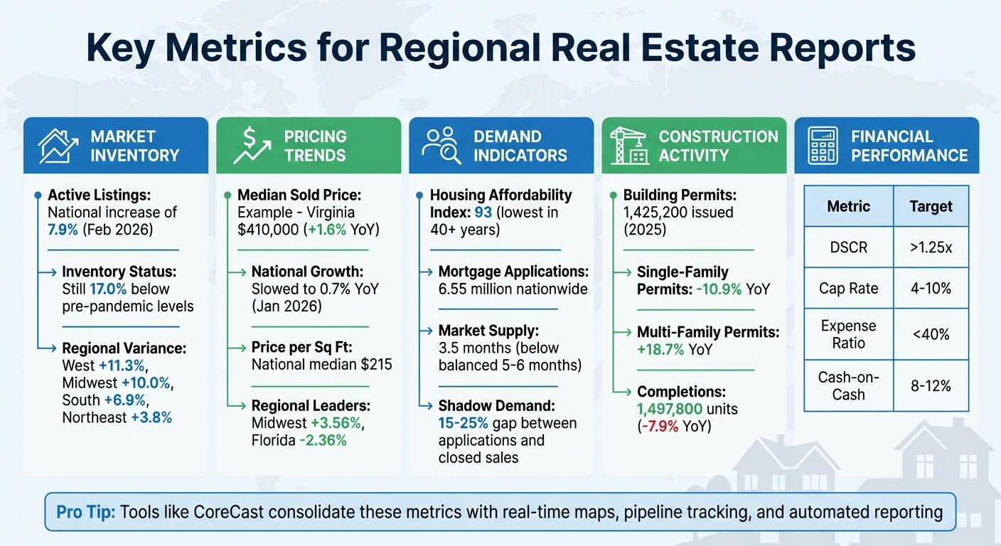
Key Metrics for Regional Real Estate Reports
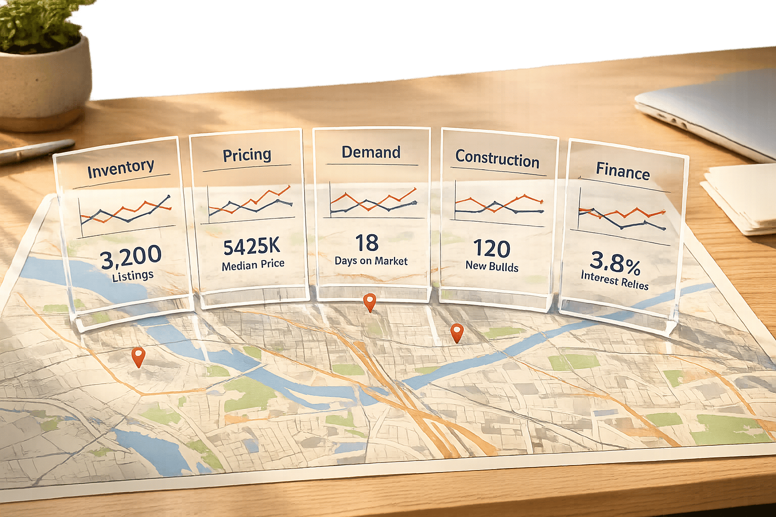
Understanding local real estate markets requires specific metrics that go beyond national averages. Here’s a quick breakdown of the most important data points to track for making informed decisions:
- Market Inventory: Active listings and sold homes per available inventory reveal supply levels and market trends. For example, in February 2026, active listings increased by 7.9% nationally, but inventory remains below pre-pandemic levels in many areas.
- Pricing Trends: Metrics like median sold price and price per square foot highlight buyer spending and property value changes. Median prices in some regions are dropping, while others, like the Midwest, are seeing growth.
- Demand Indicators: Mortgage application volumes and housing affordability index (HAI) scores show buyer interest. The HAI hit its lowest point in decades, signaling affordability challenges.
- Construction Activity: Building permits and completions signal future supply. While multi-family permits surged, single-family permits declined, reflecting shifting developer priorities.
- Financial Performance: Metrics like DSCR, cap rates, and occupancy rates help evaluate the financial health of properties. For example, a DSCR above 1.25x is often required by lenders to ensure stability.
These metrics offer a clear picture of local market dynamics, helping stakeholders - from investors to lenders - make better decisions.
Pro Tip: Tools like CoreCast simplify regional reporting by consolidating data sources and automating report delivery, ensuring accuracy and saving time. With features like real-time maps and pipeline tracking, it’s easier to spot trends and opportunities in any market.
Essential Real Estate Metrics Guide: Key Indicators for Regional Market Analysis
The Most IMPORTANT Real Estate Return Metrics [+ How To Use Each]
sbb-itb-99d029f
Market Inventory Metrics
Real estate availability helps determine whether the market leans toward buyers or sellers. Two critical indicators are active listings and sold homes per available inventory, which together paint a picture of supply levels and how quickly properties are selling.
Number of Active Listings
Active listings represent all homes available for sale during a specific period, while inventory reflects the homes still unsold at the end of that period [1]. This distinction is important: active listings show the variety of options buyers had throughout the month, whereas inventory highlights what remains for the next month.
In February 2026, national active listings hit 914,860 homes, marking a 7.9% increase compared to the previous year [2]. However, this growth wasn't evenly distributed. The West experienced an 11.3% increase, followed by the Midwest with 10.0%, the South with 6.9%, and the Northeast trailing at 3.8% [2]. Despite these gains, the national housing supply was still 17.0% below February 2019 levels [2]. The Northeast, in particular, remains constrained, with inventory 56.8% below pre-pandemic levels, while the West has surpassed 2019 levels by 1.1% [2].
"Inventory has improved for more than two years, but the momentum has faltered in recent months. Supply gains have been concentrated in the South and West and skewed toward homes priced below $500,000." - Danielle Hale, Chief Economist, Realtor.com [2]
Regional differences are striking. In January 2026, Washington State reported 12,376 active listings, a 20.9% year-over-year increase [3], while Georgia recorded 23,705 active listings, up 9.2% [4]. Some metro areas, such as Denver (+81.9%) and San Antonio (+69.4%), now have significantly more inventory than pre-pandemic levels. Conversely, Hartford, CT remains 82.1% below its pre-pandemic inventory [2]. Generally, higher inventory suggests a buyer’s market, where negotiation is easier, while lower inventory points to a seller’s market, driving up competition and prices [1].
The next step is to assess sold homes per available inventory to better understand market dynamics. This data is essential for a comprehensive real estate deal analysis.
Sold Homes per Available Inventory
This metric evaluates how efficiently homes are selling by comparing closed sales to available inventory. It’s essentially the inverse of "Months of Supply", which calculates how many months it would take to sell all current inventory at the current sales pace [1]. A six-month supply is traditionally viewed as balanced [5], with anything less favoring sellers and anything more favoring buyers.
In Georgia, months of supply reached 4.0 in January 2026, reflecting an 11.1% year-over-year increase [4]. While the market still leans toward sellers, the growing inventory is shifting the balance. Nationally, homes had a median of 70 days on the market in February 2026 - four days longer than the same period the previous year [2]. This slowdown indicates that as supply increases, properties are taking longer to sell.
Changes in this ratio have a direct impact on pricing and negotiation. When inventory grows faster than sales, buyers gain leverage. On the other hand, sellers retain the upper hand in markets where demand continues to outpace supply.
Pricing and Sales Metrics
After evaluating inventory, pricing and sales metrics provide a deeper understanding of the market's regional conditions. Metrics like property prices and sales speed offer a snapshot of market health, complementing inventory data for a more complete perspective.
Median Sold Price
Median sold price offers insight into buyer spending trends by identifying the middle sale value, unaffected by extreme highs or lows [8]. Unlike averages, the median provides a clearer picture of what a "typical" buyer is paying in a given area [8][9].
In February 2026, Virginia's statewide median sales price hit $410,000, reflecting a 1.6% increase ($6,500) from the previous year [7]. On a national scale, home price growth slowed to 0.7% year-over-year in January 2026, a significant drop from 3.5% at the start of 2025 [6]. However, the Midwest defied this trend with an average growth of 3.56% in early 2026, while Florida saw the steepest decline at -2.36% [6].
"The current data reveals a 'two-speed' housing market. While high-cost coastal and sunbelt regions undergo price corrections, the Midwest and Northeast are proving remarkably resilient due to their relative affordability and stable employment bases." - Dr. Selma Hepp, Chief Economist, Cotality [6]
Analyzing both median and average prices can reveal shifts in market composition. For example, in January 2026, Atlanta’s median sold price dropped 3.66% year-over-year to $395,000, while the average sold price rose 2.46% to $647,748 [9]. This occurred because high-priced sales made up a larger share of closings, even as the price of a "typical" home decreased. Using rolling medians over 3 or 12 months can smooth out fluctuations, but it's crucial to verify the number of sales behind the median to ensure accuracy [8].
Average Days on Market
Days on Market (DOM) measures how long properties stay listed. Shorter DOM typically benefits sellers, while longer DOM gives buyers more negotiation power [8]. This metric reflects negotiation dynamics rather than inventory levels. Properties that linger on the market often face price reductions. Regional DOM variations depend on local supply and demand: rising inventory tends to lengthen DOM, while limited supply keeps it shorter due to heightened competition.
Median Price per Square Foot
Price per square foot (PPSF) standardizes property values, making comparisons easier. Smaller properties and new constructions usually have higher PPSF [10]. Nationally, the median PPSF is $215, though regional differences are significant.
High-cost areas like Manhattan see PPSF ranging from $1,400 to $2,500, while San Francisco falls between $850 and $1,200 [10]. Mid-range markets such as Denver ($325–$425) and Austin ($275–$375) sit in the middle, while more affordable markets like Indianapolis ($125–$175) and Memphis ($95–$135) are well below the national median [10].
Smaller homes often command higher PPSF because fixed costs make up a larger share of the total [10]. New construction typically carries a premium of 15% to 25% over existing homes, and high-end finishes can push prices 20% to 40% above market averages [10]. Properties priced 10–15% below the neighborhood's median PPSF may signal investment potential - provided structural issues aren’t the cause [10].
When comparing PPSF, it’s essential to focus on similar property types and locations. Only finished, above-grade living spaces should be included in calculations, and sample sizes must be checked to ensure reliable data [10][8].
Demand and Activity Metrics
Understanding market momentum requires looking beyond just pricing and inventory. Metrics tied to demand and construction activity provide valuable insights into whether a regional market is gaining or losing steam. Let’s take a closer look at how real estate demand is evolving and what construction trends reveal about future housing supply. Utilizing custom reporting tools can further streamline how these data points are analyzed.
Real Estate Demand Growth
Mortgage application volume serves as a key early indicator of housing demand. In 2024, the total number of mortgage applications for home purchases nationwide rose slightly by 0.2%, reaching 6.55 million. However, regional differences were stark - Appleton, WI experienced a sharp 19% increase, while the San Francisco-Oakland-Fremont area saw a 17% decline [11].
A growing "shadow demand" presents another layer to the story. There’s currently a 15–25% gap between purchase applications and closed sales year-over-year, with nearly 60% of listings being withdrawn by November 2025 [13]. This gap underscores a pool of potential buyers holding off until market conditions improve.
Affordability remains a major constraint. The Housing Affordability Index (HAI) hit 93 in early 2026, marking its lowest level in over four decades [12]. An HAI reading below 100 means the typical family cannot afford a median-priced home with a standard mortgage, limiting buyer activity. Despite this, tight inventory - just 3.5 months of housing supply compared to the balanced range of 5 to 6 months - continues to prop up home prices [12].
"The market is shifting toward a new era where incomes rise faster than home prices and the deep freeze of the last few years begins to thaw." - Mike Simonsen, Chief Economist, Compass [13]
While demand metrics provide a snapshot of current buyer interest, construction activity offers a glimpse into future supply trends.
Construction Activity Metrics
Building permits are a reliable indicator of upcoming housing supply [14]. In 2025, the U.S. issued 1,425,200 housing permits, reflecting a 3.6% decline from the previous year [15]. Single-family permits dropped significantly, down 10.9% year-over-year in December 2025, while multi-family permits surged by 18.7% [15]. This shift suggests builders are focusing more on high-density urban projects to meet strong rental demand.
Regional data highlights where developers see growth opportunities. For instance, the Northeast saw a 17.4% rise in permits in December 2025, with the West close behind at 13.5%, even as the national trend showed a decline [15]. Notably, California and Texas accounted for nearly 22% of all new construction authorizations in early 2026 [14].
When it comes to completions, the numbers reflect caution among builders. Total home completions in 2025 fell by 7.9% from the previous year, totaling 1,497,800 units. Rising costs for land, labor, and materials played a role in this slowdown [15].
Permits, starts, and completions collectively provide a fuller picture of how quickly new housing supply might hit the market [12][15]. As of early 2026, building permits were tracking at an annualized rate of about 1.45 million units [12]. However, this figure falls short of the 1.5 to 1.7 million units estimated to be needed annually to meet demand driven by household formation [12]. Declining single-family permits in certain regions could signal future housing shortages, potentially driving up property values as existing inventory becomes more sought after [14].
Financial Performance Metrics
Evaluating how properties generate income and maintain financial health is crucial for creating reports that meet stakeholder expectations and ensuring stable investor returns, especially during economic fluctuations.
| Metric | Formula | Target/Benchmark |
|---|---|---|
| DSCR | Net Operating Income / Annual Debt Service | > 1.25x [16][17] |
| Cap Rate | Net Operating Income / Property Value | 4% - 10% (varies by market) [16] |
| Expense Ratio | (Operating Expenses / Gross Rental Income) x 100 | < 40% [17] |
| Cash-on-Cash | Annual Pre-Tax Cash Flow / Total Cash Invested | 8% - 12% [16] |
The Debt Service Coverage Ratio (DSCR) is a key metric for assessing whether a property generates enough income to cover its mortgage payments. A DSCR of 1.25x or higher is typically required by lenders, meaning the property earns at least 25% more than its debt obligations [16][17]. A falling DSCR can indicate financial strain, so keeping operating costs below $150 per unit can help safeguard net operating income [17].
Average Rent Price per Property
Tracking average rent prices is essential for spotting income trends. This metric is calculated by dividing total monthly revenue by the number of properties [18]. It reflects whether landlords are successfully adjusting rents to keep pace with inflation and rising expenses.
Occupancy and Vacancy Rates
The balance between occupied and vacant units is a direct indicator of income stability. Even if rent prices are high, elevated vacancy rates can rapidly cut into cash flow. High vacancies may point to an oversupplied market or declining tenant demand in specific areas. Breaking down these rates by property type and neighborhood in regional reports helps identify where financial performance is strongest.
These financial metrics integrate seamlessly into CoreCast's reporting tools, providing detailed insights for regional real estate analysis.
Using CoreCast for Regional Real Estate Reporting

Streamline your regional real estate reporting with CoreCast, an all-in-one platform that simplifies the process by consolidating data sources. Instead of juggling multiple tools, CoreCast provides real-time insights through features like integrated maps, pipeline tracking, and portfolio analysis. These tools make it easy to deliver accurate, timely reports to stakeholders.
Building on the metrics we discussed earlier, CoreCast's integrated maps offer a clear visual of properties and competitive inventory. For instance, you could overlay active listings with sold homes to analyze supply and demand. Imagine reporting on Austin, TX, with data showing 5,200 active listings and 1,200 homes sold in the past month. This setup quickly highlights areas of high demand or potential construction opportunities, all formatted to align with U.S. conventions.
Pipeline tracking simplifies deal monitoring, covering every step from listing to closing. It automatically calculates key metrics like sold homes per inventory and year-over-year price changes. For example, a stakeholder in Miami might see a dashboard showing 15% growth in demand, driven by mortgage applications and population trends. These updates seamlessly feed into quarterly reports, formatted in U.S. currency (e.g., $2.50/sq ft), eliminating the need for manual data entry and reducing errors common in Excel workflows.
The key stakeholder center takes reporting to the next level by automating the delivery of customized, branded reports. These reports are tailored to specific audiences. Investors might see summaries of IRR and portfolio values and portfolio values with interactive gauges and heatmaps, while operators could view occupancy rates and lease expirations in an engaging format. For example, a New York investor might receive a branded PDF showing a 7.2% vacancy rate and an average rent of $4,200/unit, formatted with precise U.S. number conventions (e.g., 1,234.56). This ensures that every stakeholder gets relevant, actionable insights without the hassle of manual compilation.
CoreCast also integrates with property management systems, pulling in data like vacancy rates and rent figures. However, it focuses on delivering high-level intelligence rather than detailed bookkeeping. For example, a 6% vacancy rate can be seamlessly incorporated into portfolio analysis, giving stakeholders clear insights into ROI and demand trends without overwhelming them with transactional details. This makes CoreCast a powerful tool for delivering data-driven results.
Conclusion
Regional reports provide crucial insights by focusing on key metrics like market inventory, pricing trends, demand indicators, and financial performance. Together, these elements offer a clear view of local market conditions, helping stakeholders determine whether the market favors buyers or sellers, assess property turnover rates, and evaluate if investments are meeting expectations.
Manual processes, however, can undermine the accuracy and timeliness of these reports. Errors and delays caused by manual compilation can lead to missed opportunities and unreliable data.
That’s where CoreCast comes in. By consolidating multiple data sources and automating report delivery, CoreCast turns real estate investment reporting into a seamless, reliable process. The platform integrates tools like real-time maps, pipeline tracking, and portfolio analysis, reducing manual work and ensuring critical metrics - such as average rent and vacancy rates - are always accurate and up-to-date.
CoreCast’s stakeholder-focused features make it easy for investors to access financial metrics and portfolio insights, while operators can track occupancy trends and lease expirations effortlessly. Each report is customized and branded for its audience, eliminating the need for tedious manual compilation. This streamlined approach not only saves time but also enables faster, more confident decision-making.
FAQs
What’s the fastest way to tell if a local market favors buyers or sellers?
The easiest way to figure out if a local housing market leans toward buyers or sellers is by looking at the ratio of home sellers to buyers. In a seller's market, sellers exceed buyers by more than 10%. On the flip side, a buyer's market happens when buyers outnumber sellers by over 10%.
How should I compare median price, average price, and price per square foot?
When it comes to understanding home prices, three metrics often come into play: median price, average price, and price per square foot. Each serves a unique purpose in painting a clearer picture of the market.
- Median price represents the middle value of all home prices, making it less influenced by extreme highs or lows. This gives a better sense of what a "typical" home might cost.
- Average price calculates the overall mean but can be skewed by unusually high or low prices, making it better for spotting general trends rather than pinpointing typical values.
- Price per square foot breaks down the cost relative to the size of the property. This metric is especially helpful for comparing homes of varying dimensions and types.
By combining these three metrics, you get a more complete understanding of the market: the median reveals the typical price, the average highlights broader trends, and the price per square foot offers a detailed way to compare properties. Together, they provide a balanced and detailed view of real estate pricing.
Which financial metrics matter most for lenders and investors in regional reports?
Key financial metrics that matter most to lenders and investors in regional reports include IRR, Cap Rate, NOI, and Cash-on-Cash Return. These metrics provide critical insights into investment performance, property valuation, operational profitability, and cash flow. By analyzing these figures, stakeholders can make well-informed decisions about their investments.