
Why Cross-Device Design Matters in Real Estate

Cross-device design ensures real estate professionals can work smoothly across phones, tablets, and desktops without interruptions or inefficiencies. Here's why it matters:
- Consistency saves time: Real-time syncing means no re-entering data or relearning interfaces.
- Boosts productivity: Unified layouts and predictable navigation reduce errors and speed up tasks.
- Improves client experience: Faster responses and reliable tools help close deals quicker.
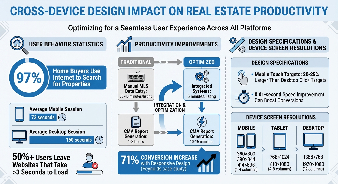
- Critical for mobile users: 97% of home buyers use the internet to search, and poor mobile design can drive them away.
Platforms like CoreCast show how syncing tools and consistent design empower professionals to focus on clients, not tech problems. When every device works as part of a single system, professionals can transition effortlessly, stay updated, and make informed decisions.
Cross-Device Design Impact on Real Estate Productivity: Key Statistics
Archviz Real Estate VR/Stream/Multi Device(PC, Phone, Tablet, Web Browser) - Unreal Engine Portfolio

Problems with Inconsistent Design Across Devices
When real estate software looks different depending on the device, it creates unnecessary hurdles for professionals. Time gets wasted, errors creep in, and workflows - from property searches to deal closures - become frustratingly inefficient. These challenges highlight just how much poor design and constant device switching can disrupt productivity.
Why Real Estate Professionals Switch Between Devices
Real estate professionals juggle multiple devices throughout their day. For instance, they might snap property photos on a smartphone during a site visit, analyze and benchmark portfolio data on a desktop at the office, and showcase investment opportunities to clients on a tablet. Each device serves a specific purpose: smartphones shine with GPS tracking and real-time updates, while desktops offer larger screens and tools for handling complex tasks like drafting contracts.
Interestingly, the average mobile session lasts only 72 seconds, compared to 150 seconds on a desktop [10]. This shorter mobile usage reflects how professionals rely on their phones for quick updates during property tours, fast responses to client inquiries, or brief checks between appointments. Without real-time syncing across devices, half-filled forms disappear, search filters reset, and saved bookmarks vanish. All of this back-and-forth eats into productivity, as explained further below.
How Poor Design Affects Productivity
Inconsistent design makes the already challenging task of switching devices even more frustrating. When interfaces differ from one device to another, professionals are forced to relearn navigation repeatedly. Imagine search filters moving to a new spot, upload buttons shifting, or key features missing entirely on mobile - it’s a time sink that pulls attention away from serving clients. UI/UX designer Harsh Mudgal sums it up well:
"Consistency reduces cognitive load, speeds up task completion and ultimately delivers a superior user experience" [7].
The impact on productivity is no small matter. For example, manually entering data into MLS systems can take 20–40 minutes per listing, but integrated systems can cut that time down to just 5 minutes. Similarly, generating a Comparative Market Analysis report might drop from 1–3 hours to just 10–15 minutes with better design [9].
Poor design also leads to more mistakes. Buttons designed for desktop mice often cause touch errors on mobile, where buttons need to be 20–25% larger for accurate input [6]. Non-responsive designs further complicate things - oversized images and cramped text can make property listings nearly unreadable on a smartphone. This forces professionals to switch back to desktops for even the simplest tasks, wasting yet more time.
Benefits of Consistent Cross-Device Design
When software is consistent across integrated platforms, it saves time and boosts productivity. Professionals can effortlessly transition between their phone, tablet, and desktop without losing focus, allowing them to close deals faster and avoid missed opportunities.
Switching Between Devices Without Interruption
Real-time synchronization is a game-changer. Imagine starting a property listing on your smartphone and finishing it on your desktop without re-entering a single detail. Features like saved searches, bookmarks, and client notes update instantly, ensuring no data is lost along the way [2]. UX designer Jacob Gruver sums it up perfectly:
"A seamless cross-platform user experience means people can complete the same tasks across multiple devices" [2].
Having predictable interfaces across devices eliminates the hassle of searching for relocated features. This smooth transition not only streamlines workflows but also helps professionals make quicker, more confident decisions.
Faster Decisions and Better Lead Conversion
A consistent design isn't just about convenience - it directly impacts performance. When professionals aren’t slowed down by confusing layouts, they can act faster and with greater precision. For instance, Reynolds reported a 71% increase in conversions after adopting responsive web design [4].
Speed matters, especially in real estate. Cross-platform apps with unified navigation and visuals provide instant access to live market data, property prices, and neighborhood stats - whether you're at a showing or back at your desk [12]. This kind of immediate access allows agents to answer client questions on the spot, avoiding delays like “I’ll get back to you.” Considering that 97% of home buyers rely on the internet during their search [11], offering quick, accurate information can make all the difference in securing a listing.
sbb-itb-99d029f
Core Principles for Cross-Device Design
Creating a seamless experience across devices is crucial for real estate professionals. Whether users are browsing on a smartphone, tablet, or desktop, the design should feel intuitive and consistent. Here’s how to achieve that.
Responsive Layouts for Different Screen Sizes
Responsive design relies on flexible layouts that adapt to various screen sizes. Instead of fixed pixel dimensions, designers use relative units like percentages to ensure content adjusts smoothly to fill the available space [13][5]. For example, images can scale automatically using the max-width: 100% property, preventing them from overflowing on smaller screens [13][5].
Media queries and breakpoints allow layouts to shift at specific screen widths. A three-column desktop layout might transform into a single-column view on mobile devices [13][14]. Many designers adopt a mobile-first approach, starting with smaller screens and scaling up. This ensures that key elements - like property addresses or high-quality images - are prioritized on devices with limited screen real estate [13][5][4].
| Device Category | Common Screen Resolutions | Typical Column Count |
|---|---|---|
| Mobile | 360×800, 390×844, 414×896 | 1–4 Columns |
| Tablet | 768×1024, 810×1080 | 4–8 Columns |
| Desktop | 1366×768, 1920×1080 | 12 Columns |
Don’t forget to include the viewport meta tag (<meta name="viewport" content="width=device-width,initial-scale=1">) in your HTML. This ensures mobile browsers don’t render pages at desktop widths [13]. Responsive layouts also set the foundation for consistent navigation.
Uniform Navigation and Visual Design
Consistency is key to reducing user effort. When menus, buttons, colors, and fonts remain the same across devices, users can navigate without confusion or frustration [1][2]. Implementing an 8px grid system - where elements are sized and spaced in multiples of 8 pixels - helps maintain alignment and visual balance across screens, whether on a tablet or desktop [15].
"The first rule for cross-platform design is maintaining a consistent user experience across Web and mobile applications and operating systems." – UXPin [1]
Testing on real devices, not just emulators, is essential. This helps you evaluate touch targets and visual quality across operating systems, ensuring a polished experience [2]. Consistent visuals build user trust and confidence in the platform.
Live Data Updates Across All Devices
Real-time analytics and synchronization are non-negotiable. If a user bookmarks a property on their phone, that bookmark should instantly appear on their desktop [4]. Cloud-based storage enables this, keeping saved searches, client notes, and listing updates current across all platforms [2]. This creates a central source of truth for all investment and asset data.
"User data should be synced in real-time across devices to prevent interruptions. Whether it's a shopping cart, playlist, or document, users expect their progress to be saved and accessible whenever and wherever they resume." – Jacob Gruver, UX Designer [2]
For real estate, where listings change frequently, synchronization ensures users always see the latest prices and availability. This principle also extends to handling varied network conditions. Cross-device notifications can prompt users to pick up where they left off, creating a seamless handoff between devices [2]. Testing under real-world conditions, like spotty connections in basements or urban environments, can uncover latency issues that emulators might miss [14].
Cross-Device Design in CoreCast
Working Across Devices in CoreCast
CoreCast takes the idea of cross-device consistency and runs with it, creating a seamless real estate experience across all your devices. By leveraging cloud-based synchronization, it ensures that tasks like underwriting drafts, deal pipelines, and portfolio analyses are instantly accessible whether you're on your desktop or checking updates on your phone. No need to worry about manual saves or transferring files - CoreCast keeps everything in sync, so you can move effortlessly between devices without missing a beat.
The platform is smart about tailoring its features to the strengths of each device. On mobile, touch targets are designed for easy navigation, while desktop users can take advantage of hover states and keyboard shortcuts for efficient workflows. A unified design system ties it all together, ensuring that navigation, colors, and typography look and feel consistent - whether you're reviewing property details on a tablet or sending out branded investment reports from your laptop.
CoreCast also excels in its handoff features. Updates, like changes to bookmarked properties or deal stages, sync instantly, making it easy to check the latest status while you're on the move.
Building for Growth and New Features
CoreCast isn't just about the present - it’s built with the future in mind. Its design framework is crafted to support innovation and scalability. By using design tokens, the platform can roll out global updates across all devices with ease. This means that when exciting new features, like AI-driven automation or advanced reporting tools, are introduced, they seamlessly integrate into the familiar design and functionality users already rely on. It's a thoughtful approach that ensures growth doesn't come at the expense of usability.
Conclusion
Cross-device design has become a game-changer for real estate professionals who need to stay productive no matter where they are. Imagine starting a property analysis on your phone during a site visit and wrapping up the underwriting process on your desktop later - without skipping a beat. This kind of seamless integration eliminates the friction that can slow down deals. As UI/UX Designer Gulshan Rahman aptly explains:
"Consistency goes beyond making things look the same - it's about making the experience feel the same" [3].
The numbers back this up. Over half of users will leave a website if it takes more than three seconds to load [8]. Even a tiny 0.01-second improvement in speed can boost conversions [8]. For professionals in real estate, who often switch between devices multiple times a day, even minor delays or inconsistencies can add up to major frustrations.
CoreCast exemplifies how consistent design can enhance productivity. By ensuring that deal pipelines, property analyses, and stakeholder reports sync instantly across devices, CoreCast eliminates workflow interruptions. Real-time data syncing means you’re always up-to-date, no matter which device you’re using.
The real benefit lies in reducing mental effort and enabling smooth transitions. When navigation, visuals, and interaction patterns remain uniform across your phone, tablet, and desktop, you’re free to focus on what truly matters - making informed investment decisions [3]. This is the difference between a platform that slows you down and one that empowers you to work smarter, not harder. With this kind of seamless experience, real estate professionals can zero in on strategic, high-value tasks.
FAQs
How does cross-device design boost efficiency for real estate professionals?
Cross-device design makes life easier by ensuring that real estate tools and platforms work smoothly across desktops, tablets, and smartphones. With this approach, professionals can move between devices without having to figure out new navigation systems or features, saving both time and frustration.
This seamless experience allows real estate professionals to stay on top of their game. They can quickly access key data, manage listings, and stay connected with clients no matter what device they’re using. Take platforms like CoreCast, for example. They adapt effortlessly to different screens, enabling users to monitor pipelines, analyze market trends, and create reports anytime, anywhere. This kind of flexibility not only simplifies day-to-day tasks but also leads to quicker decisions and improved client interactions.
Why is consistent design across devices important in real estate?
Inconsistent design across devices can cause serious headaches for user experience and harm how a brand is perceived. Imagine trying to navigate a website where the layout doesn’t adjust properly to different screen sizes - what works on a desktop might feel clunky or downright unusable on a mobile device. Buttons could be too small to tap, menus might overlap awkwardly, and images might appear distorted. All of this can leave users frustrated and less likely to stick around.
Another common pitfall is losing visual consistency. If typography, colors, or imagery don’t match across devices, the platform can feel disjointed. For instance, a polished and professional desktop experience might feel sloppy or incomplete on a smartphone. This kind of inconsistency can erode trust and make users question the platform’s reliability. Functional consistency is just as important - users should be able to interact with and navigate the platform seamlessly, no matter the device. If they have to figure out how things work every time they switch devices, their satisfaction will take a hit.
By focusing on thoughtful, cross-device design, real estate professionals can create a seamless, user-friendly experience that builds trust and keeps users engaged, no matter how they access the platform.
Why is real-time synchronization crucial for cross-device design?
Real-time synchronization plays a crucial role in cross-device design by ensuring users enjoy a uniform and smooth experience, regardless of the device they’re using. Without this feature, users might encounter outdated information or inconsistencies, which can create confusion and lead to frustration - ultimately impacting satisfaction.
By instantly updating data across all devices, real-time synchronization boosts efficiency, builds user confidence, and enables more seamless workflows. This is especially important in industries like real estate, where having accurate and up-to-date information is absolutely essential.